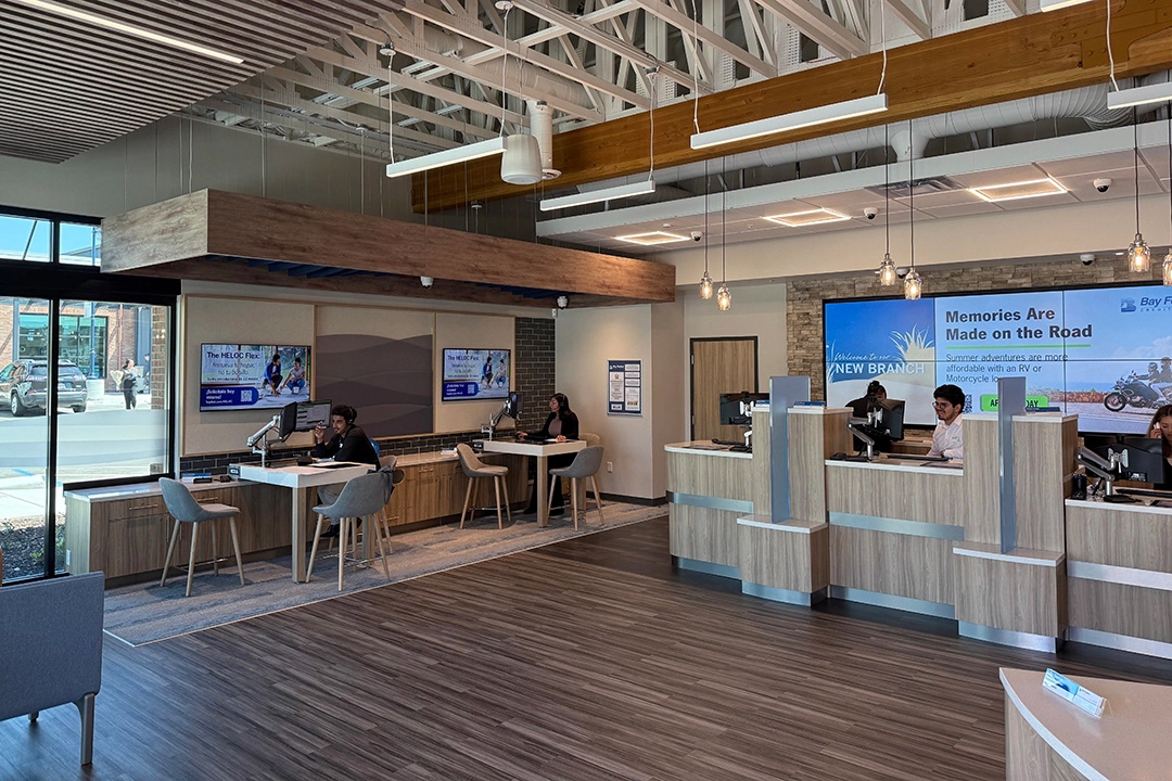
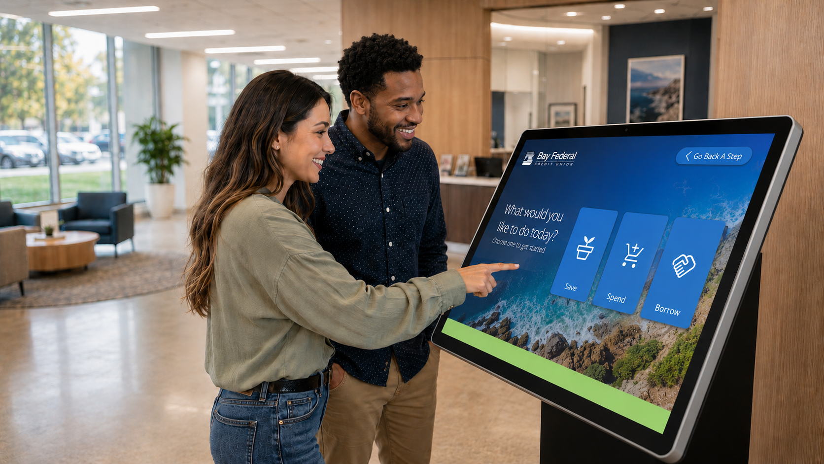
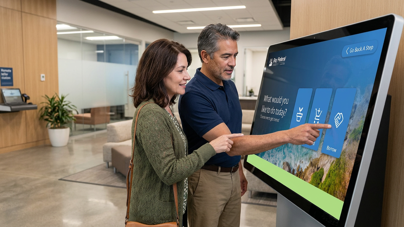
For the launch of a new Bay Federal Credit Union branch, I designed a touchscreen experience in Figma to help members find the right financial products.
Built for in-branch table displays, the interface supports both guided conversations with Financial Service Officers and self-directed exploration. The goal was to replace paper handouts with a simple, engaging digital journey that leads to confident sign-ups.
Built for in-branch table displays, the interface supports both guided conversations with Financial Service Officers and self-directed exploration. The goal was to replace paper handouts with a simple, engaging digital journey that leads to confident sign-ups.
ROUND ONE
Designed for a 42-inch touchscreen display, the experience was built into a large tabletop within the customer service area. To better understand scale and ergonomics, I tested early layouts at home by laying my TV flat on a table, simulating the at-waist interaction and refining the experience from a real-world user perspective.
Designed for a 42-inch touchscreen display, the experience was built into a large tabletop within the customer service area. To better understand scale and ergonomics, I tested early layouts at home by laying my TV flat on a table, simulating the at-waist interaction and refining the experience from a real-world user perspective.
ROUND TWO
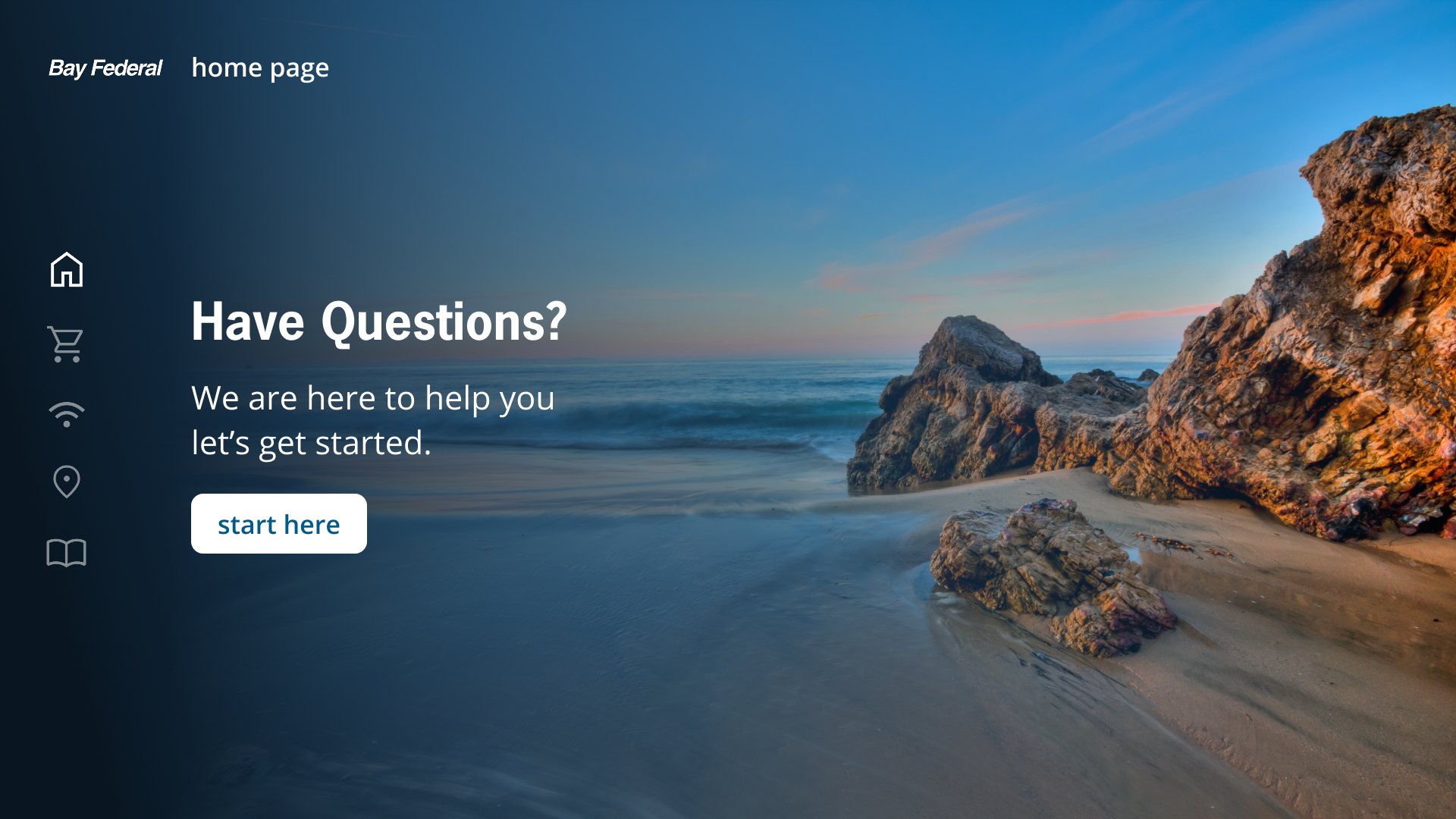
For an early iteration, I drew inspiration from the HBO TV app, incorporating a vertical navigation menu along the left side of the screen. While the layout felt familiar and structured, client feedback revealed that the icons did not read clearly enough as interactive buttons, prompting further refinement.
For an early iteration, I drew inspiration from the HBO TV app, incorporating a vertical navigation menu along the left side of the screen. While the layout felt familiar and structured, client feedback revealed that the icons did not read clearly enough as interactive buttons, prompting further refinement.
ROUND THREE
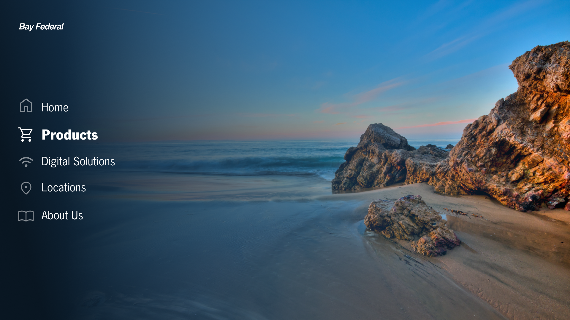
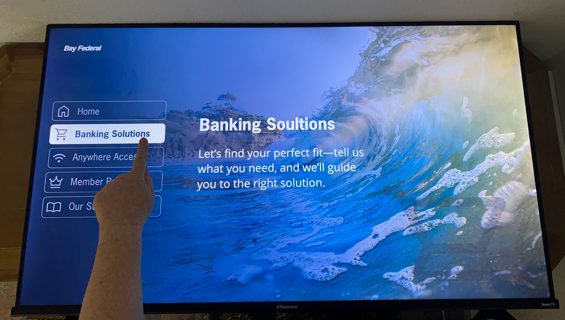
In the next round, I introduced framed square containers around each icon to more clearly signal interactivity and strengthen their presence as tappable elements within the interface.
In the next round, I introduced framed square containers around each icon to more clearly signal interactivity and strengthen their presence as tappable elements within the interface.
ROUND FOUR
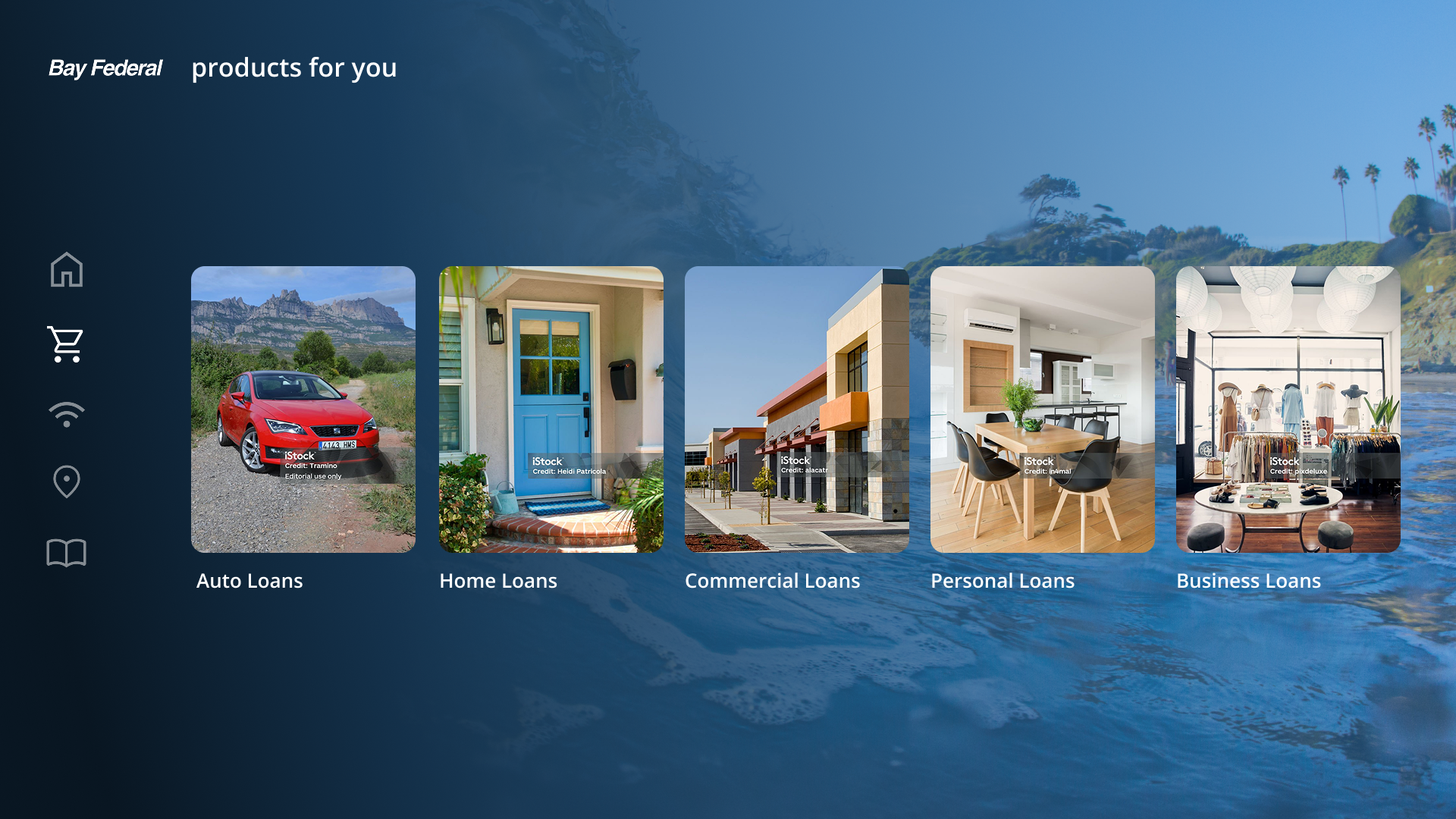
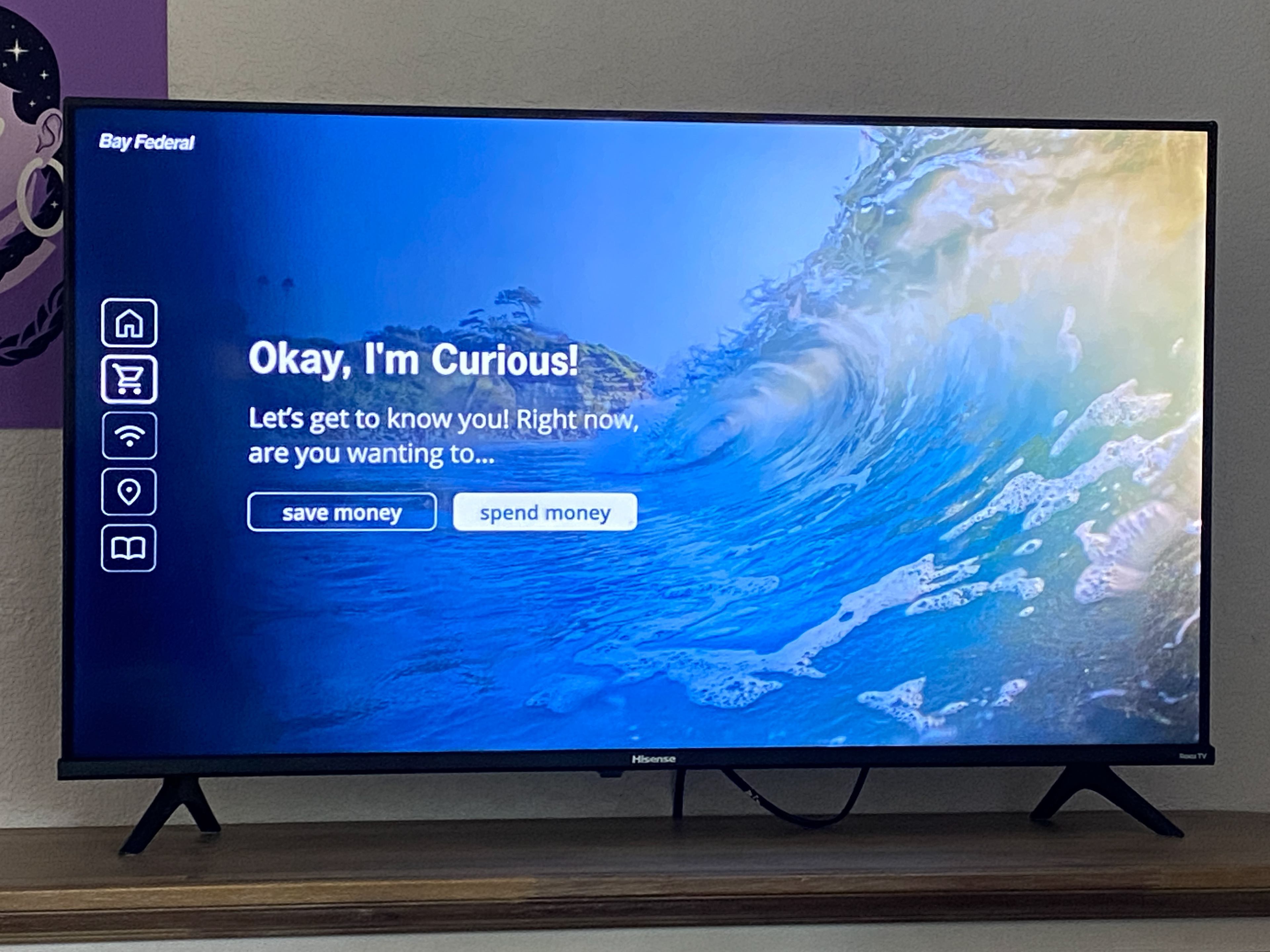
I experimented with longer, rectangular buttons and begun concepting an image carousel of product offerings, like car loans.
I experimented with longer, rectangular buttons and begun concepting an image carousel of product offerings, like car loans.
ROUND FIVE
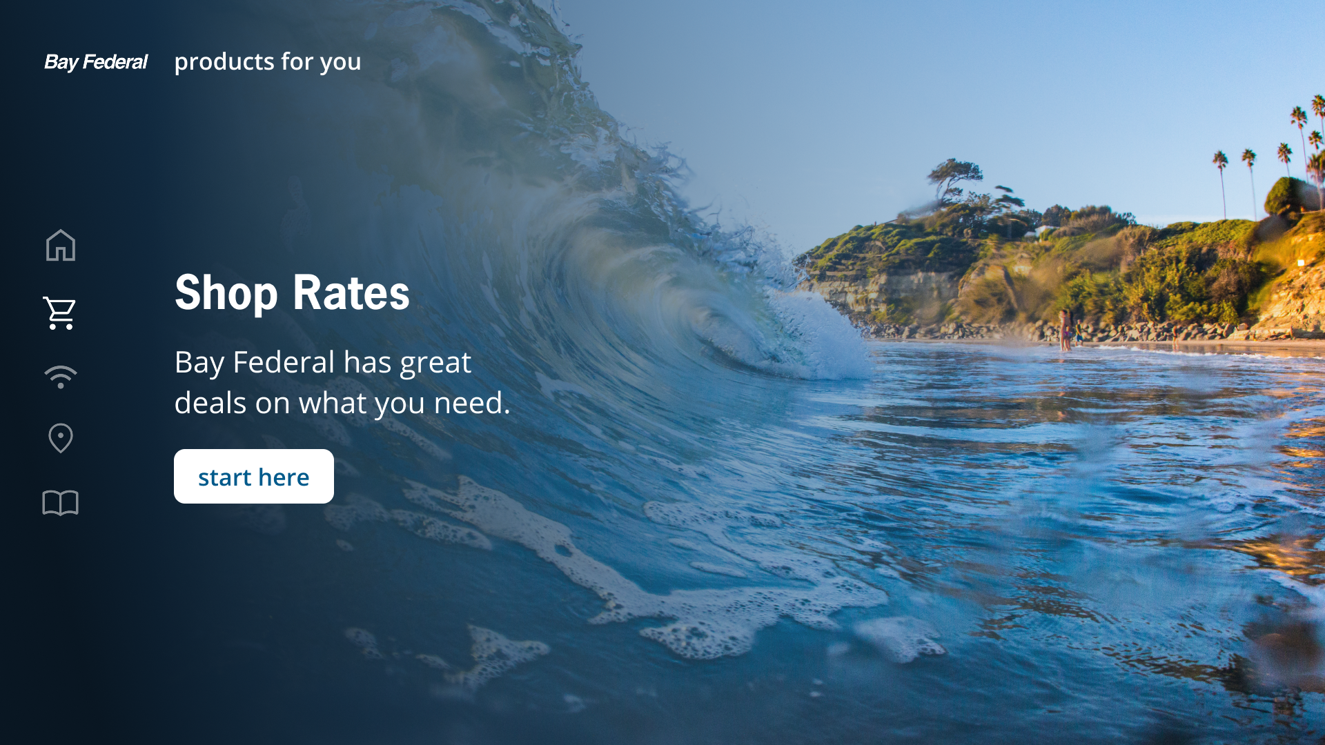
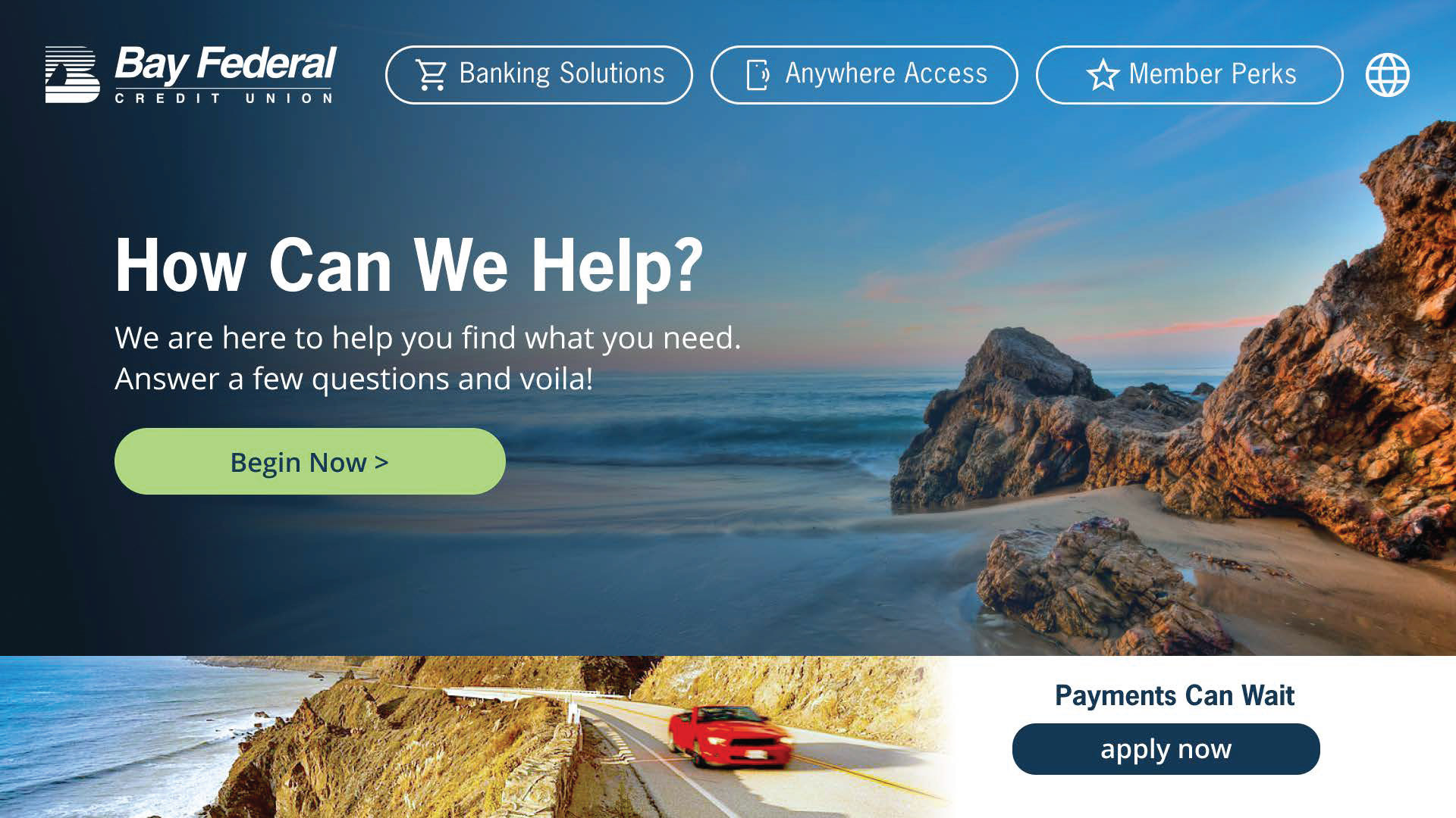
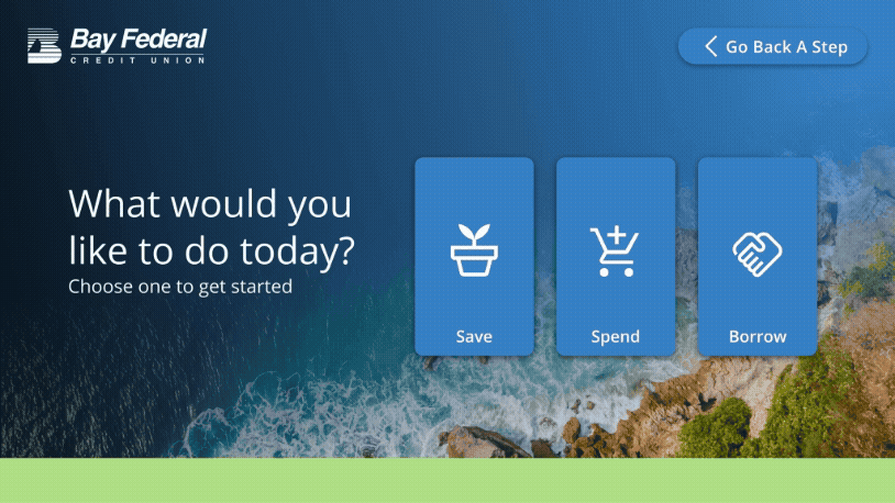
I dedicated more time to a landing page / home page that had a designated place to run promotions at the bottom. It was important to the client that the starting point of the user journey had big, clearly delineated buttons and at least two calls to action.
I dedicated more time to a landing page / home page that had a designated place to run promotions at the bottom. It was important to the client that the starting point of the user journey had big, clearly delineated buttons and at least two calls to action.

As the client became more comfortable with the look and feel of the mockups I was able to work with a copywriter on text for each user journey through the application. It was very important to the creative director that we incorporate the company's lime green color into the layouts, so you will see more green in the round five mockups above.


FINAL ROUND
The final layouts, icons, and photography direction were designed and approved within eight days—an accelerated timeline that ensured the touchscreen launched on schedule just three weeks later.
Prior to my involvement, multiple unsuccessful design rounds with another team had delayed development by two weeks. By collaborating closely with the developers in Figma and iterating in real time, I helped realign design and production, bringing the project back on track and across the finish line in time for launch.

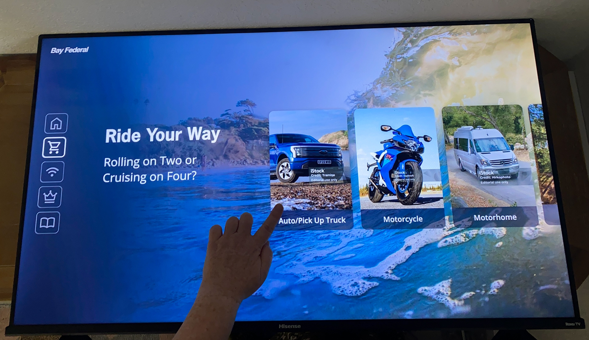
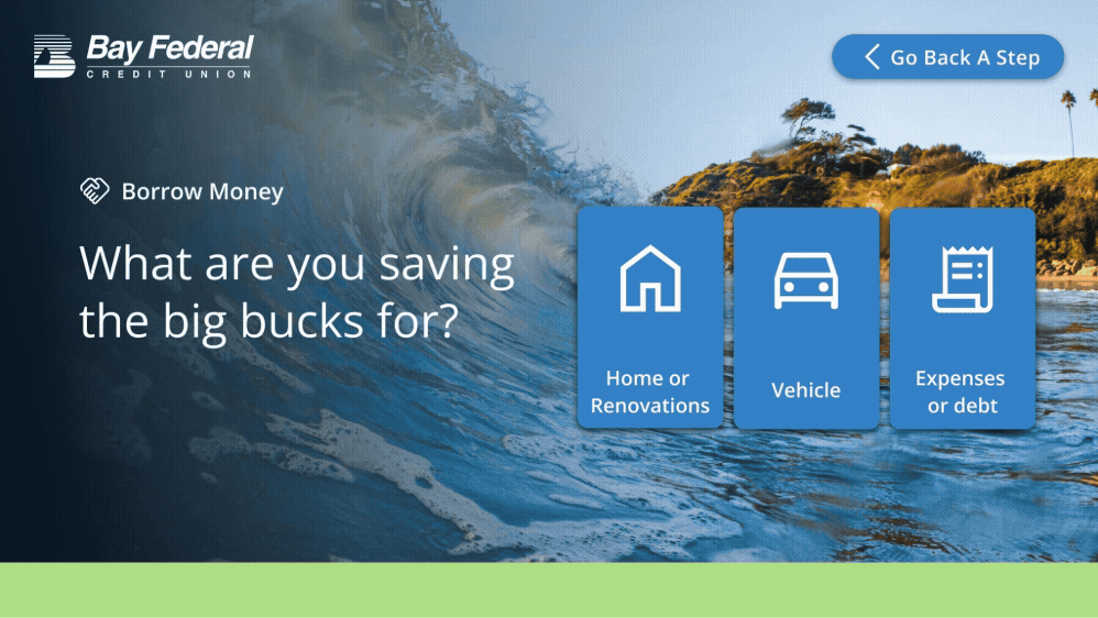
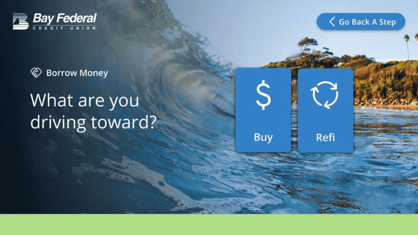
BORROW MONEY SEGMENT
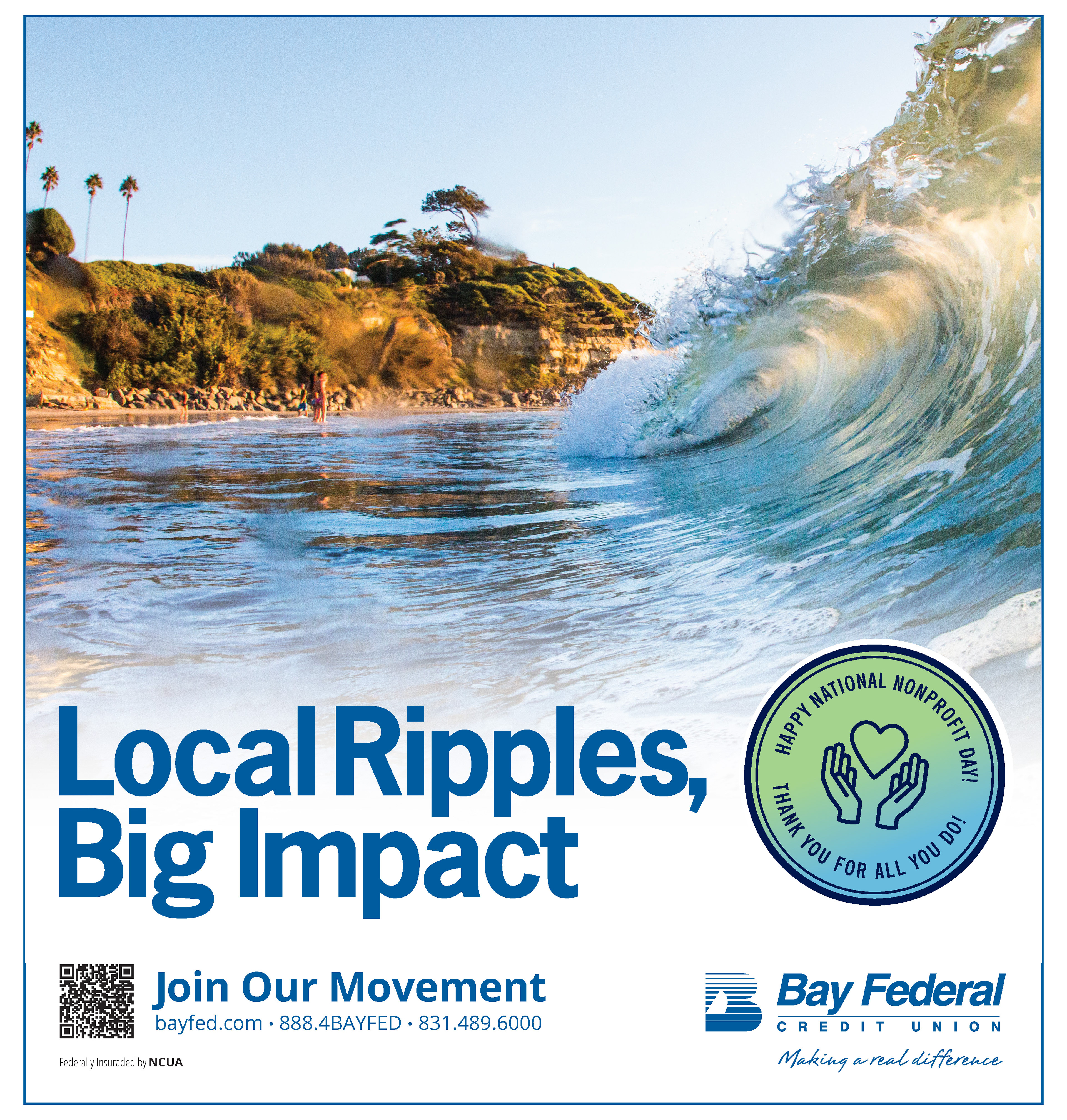
Thematically tied to the company branded ocean wave image
Thematically tied to the company branded ocean wave image
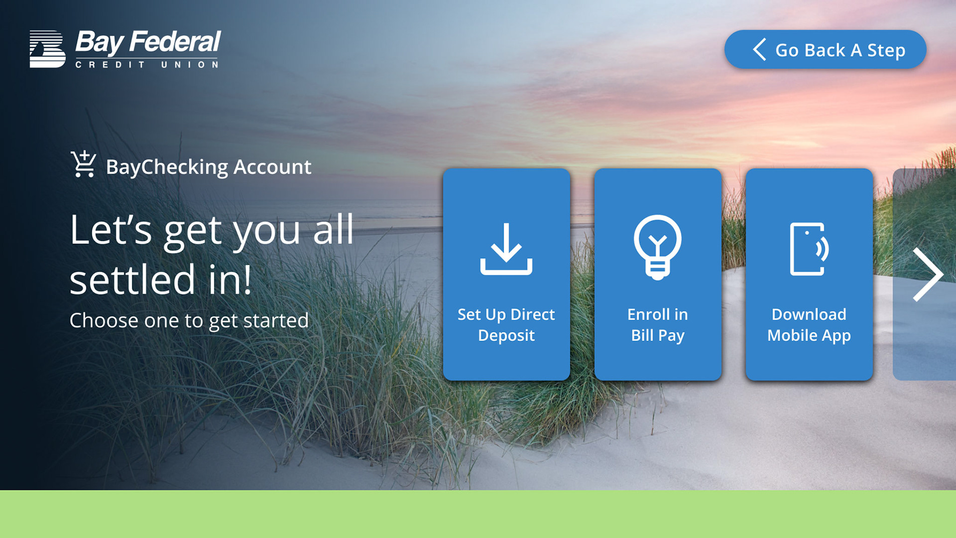
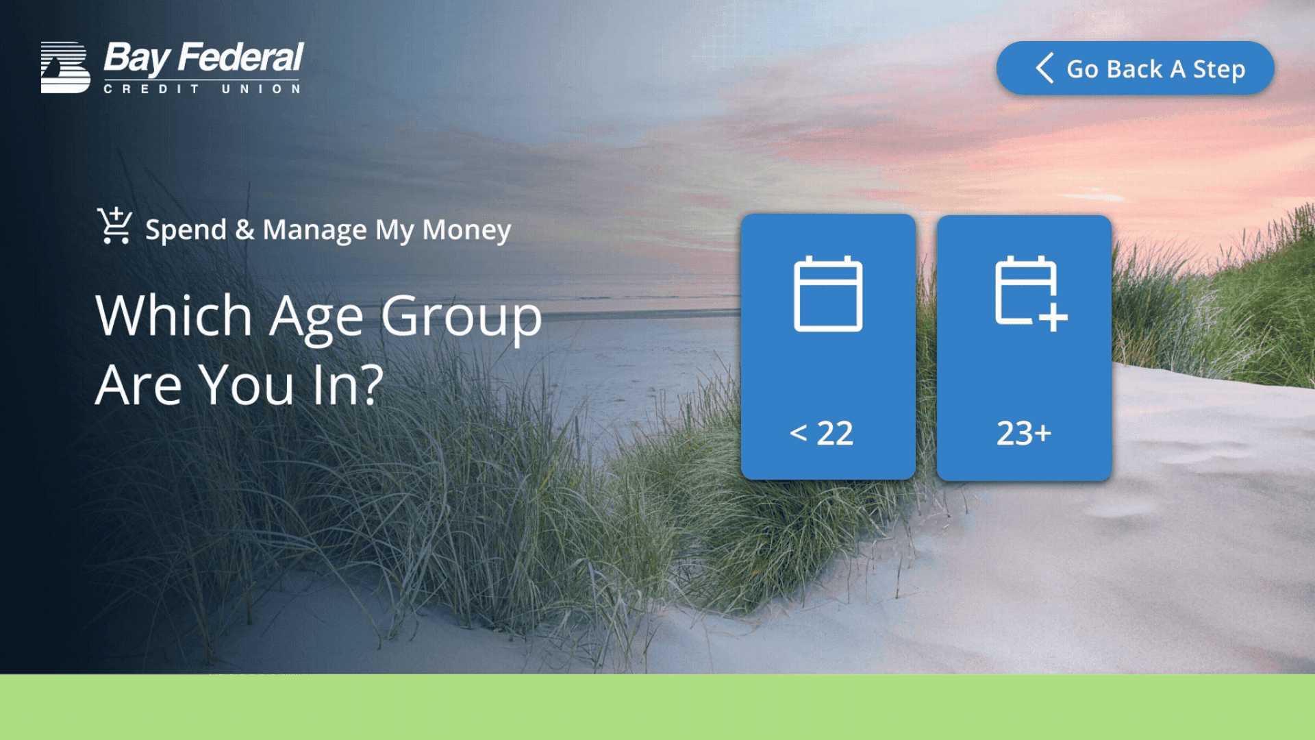
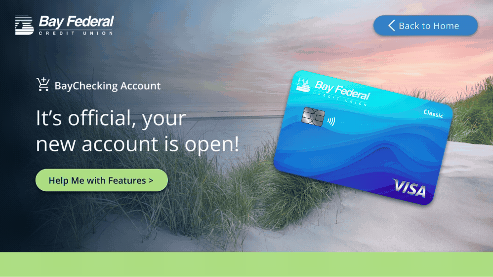
SPEND MONEY SEGMENT
Thematically tied to the company branded sand dune image
Thematically tied to the company branded sand dune image
OTHER MISC PROJECTS
Below are some other projects that I worked on for Bay Fed
Below are some other projects that I worked on for Bay Fed
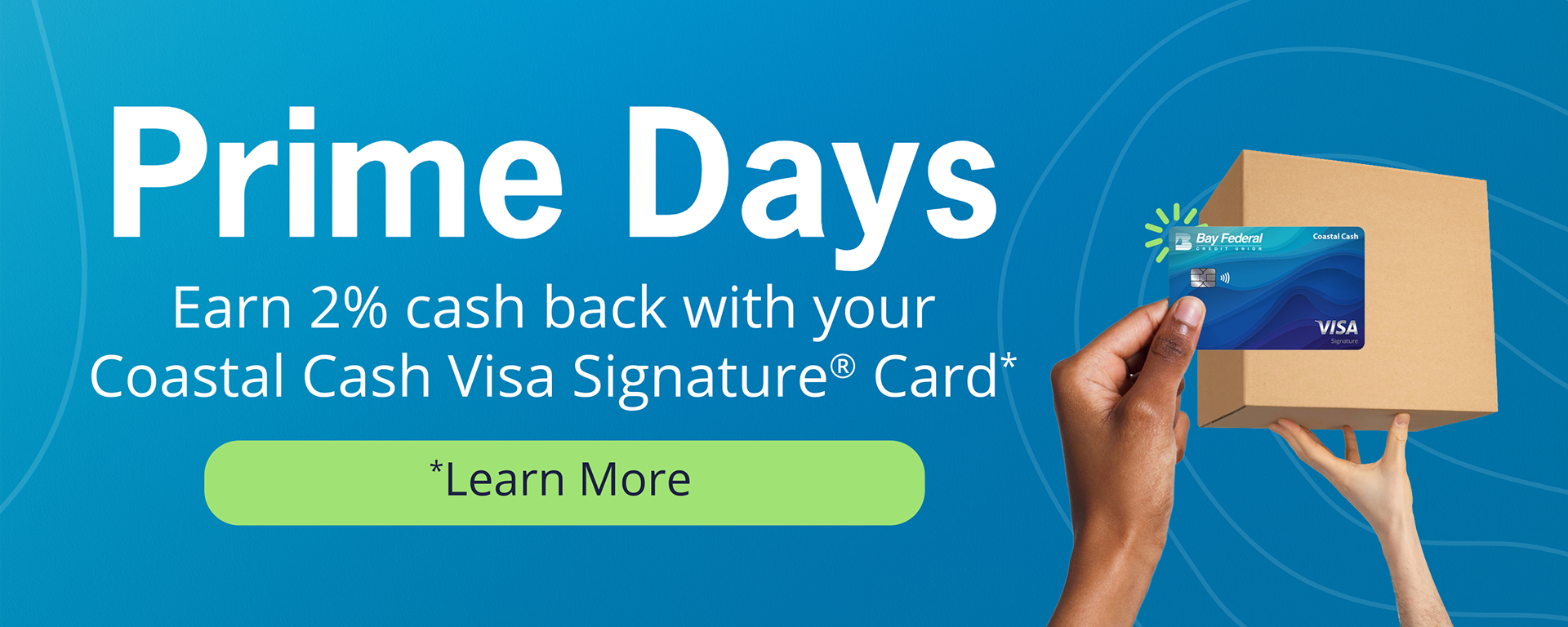
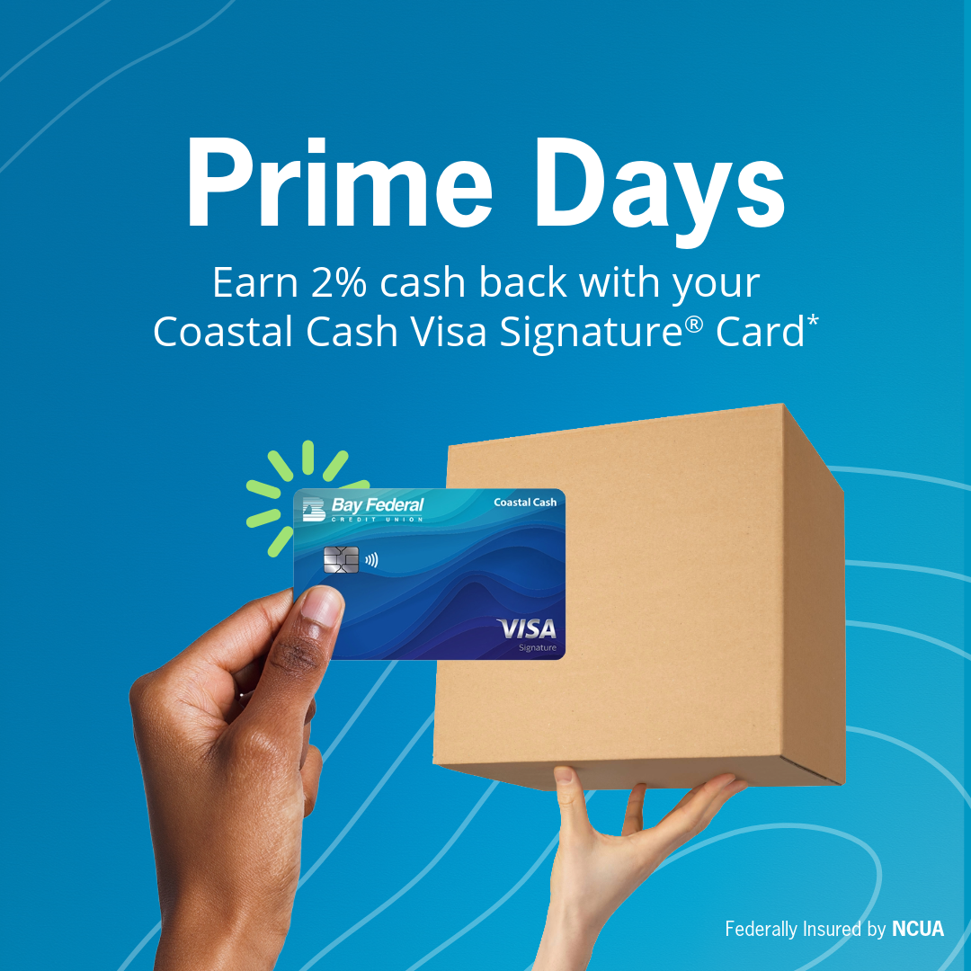
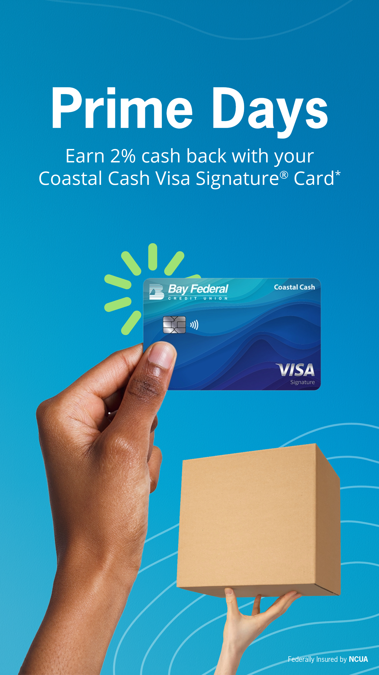


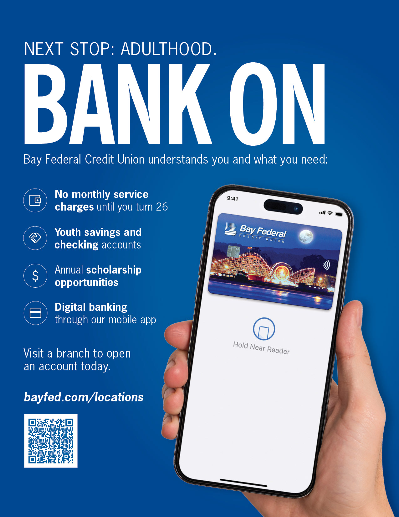
Below: social media post templates