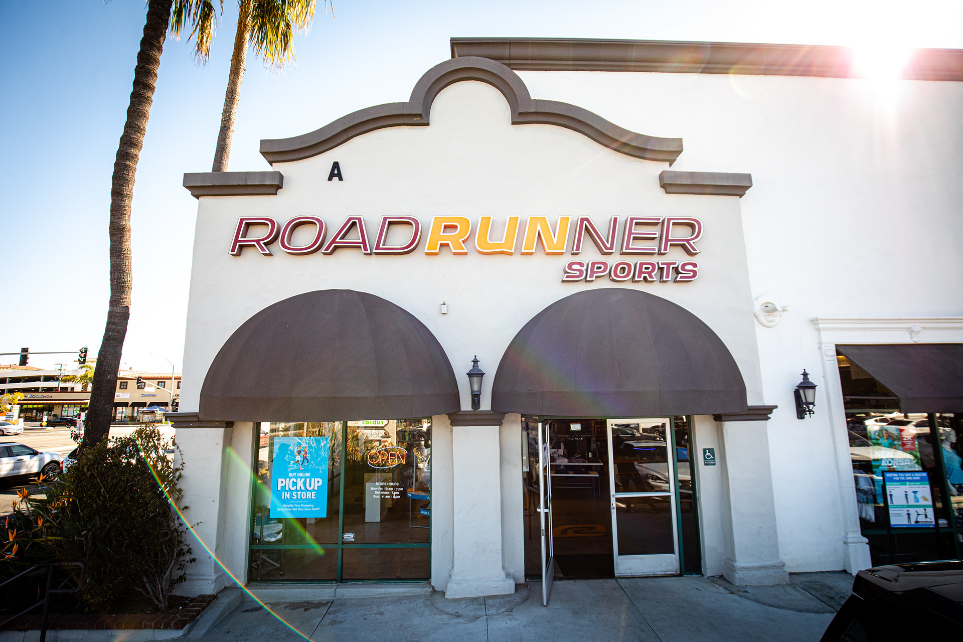
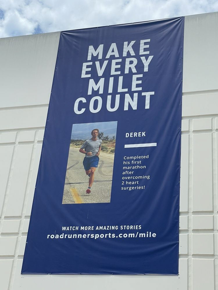
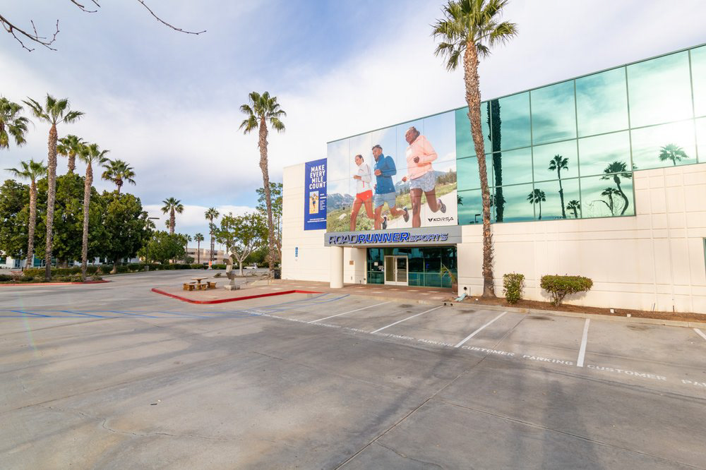
I worked a graphic designer at Road Runner Sports. A chain of 40+ running supply stores located all across the United States. Our team of 20+ people in marketing collaborated to develop multi-channel campaigns.
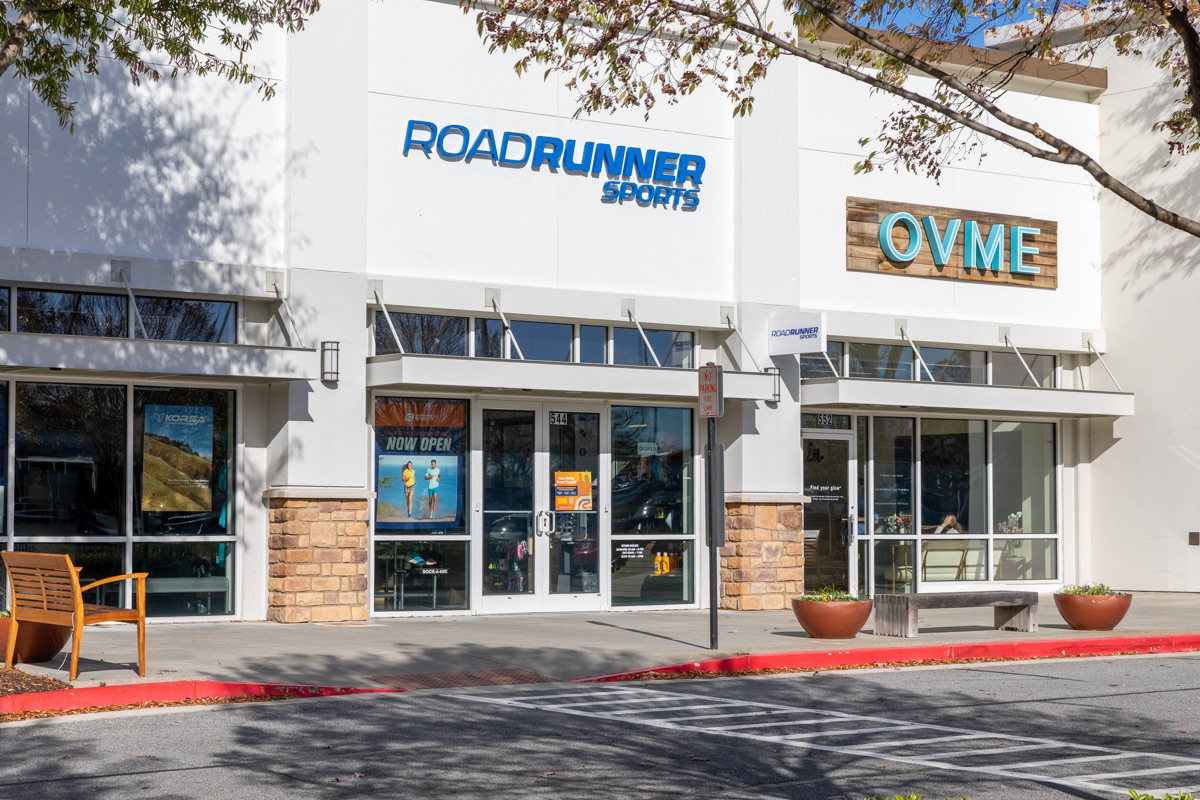

One of the first campaigns I worked on was the Tent Sale.
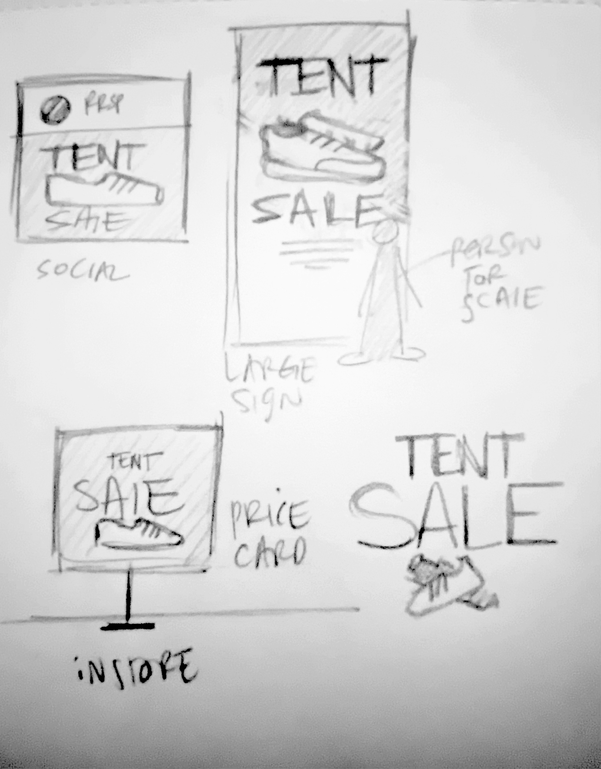
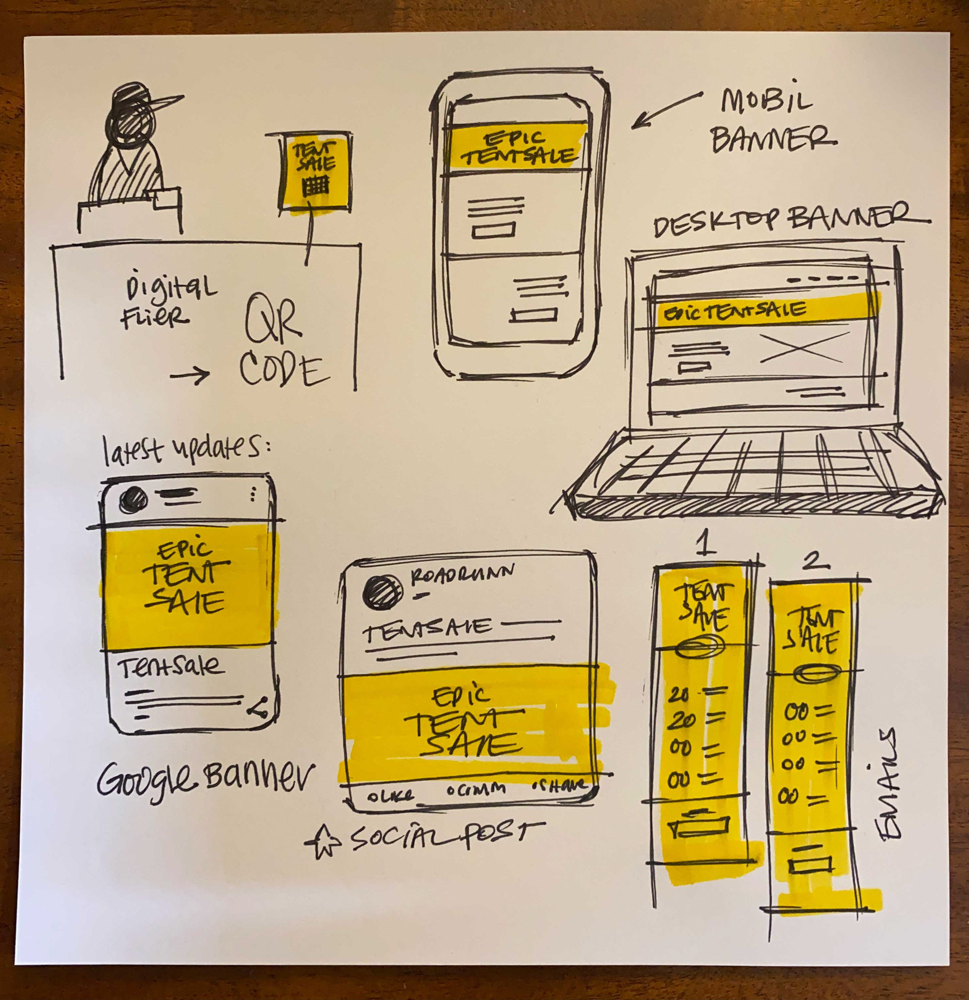
Below: Sketches made during the kick-off meeting to help get the ball rolling. We talked about making images of sneakers the hero for this campaign.
Below: Sketches made during the kick-off meeting to help get the ball rolling. We talked about making images of sneakers the hero for this campaign.
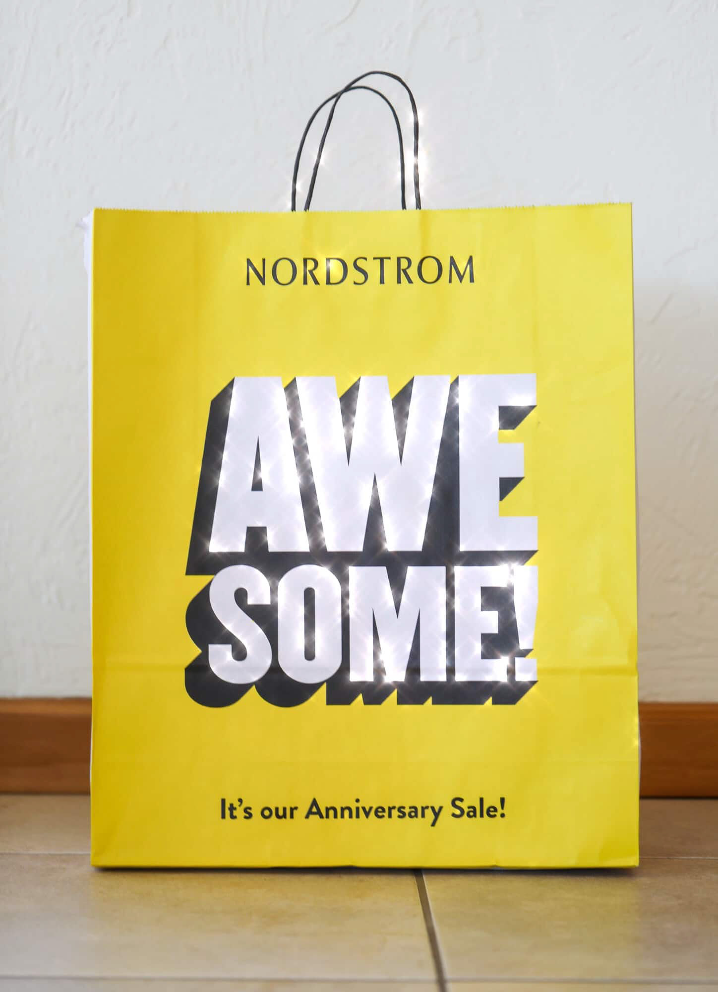
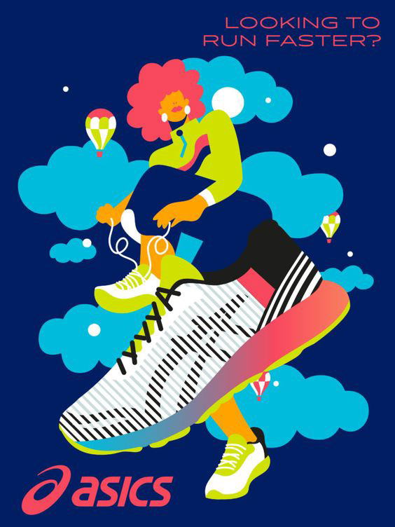
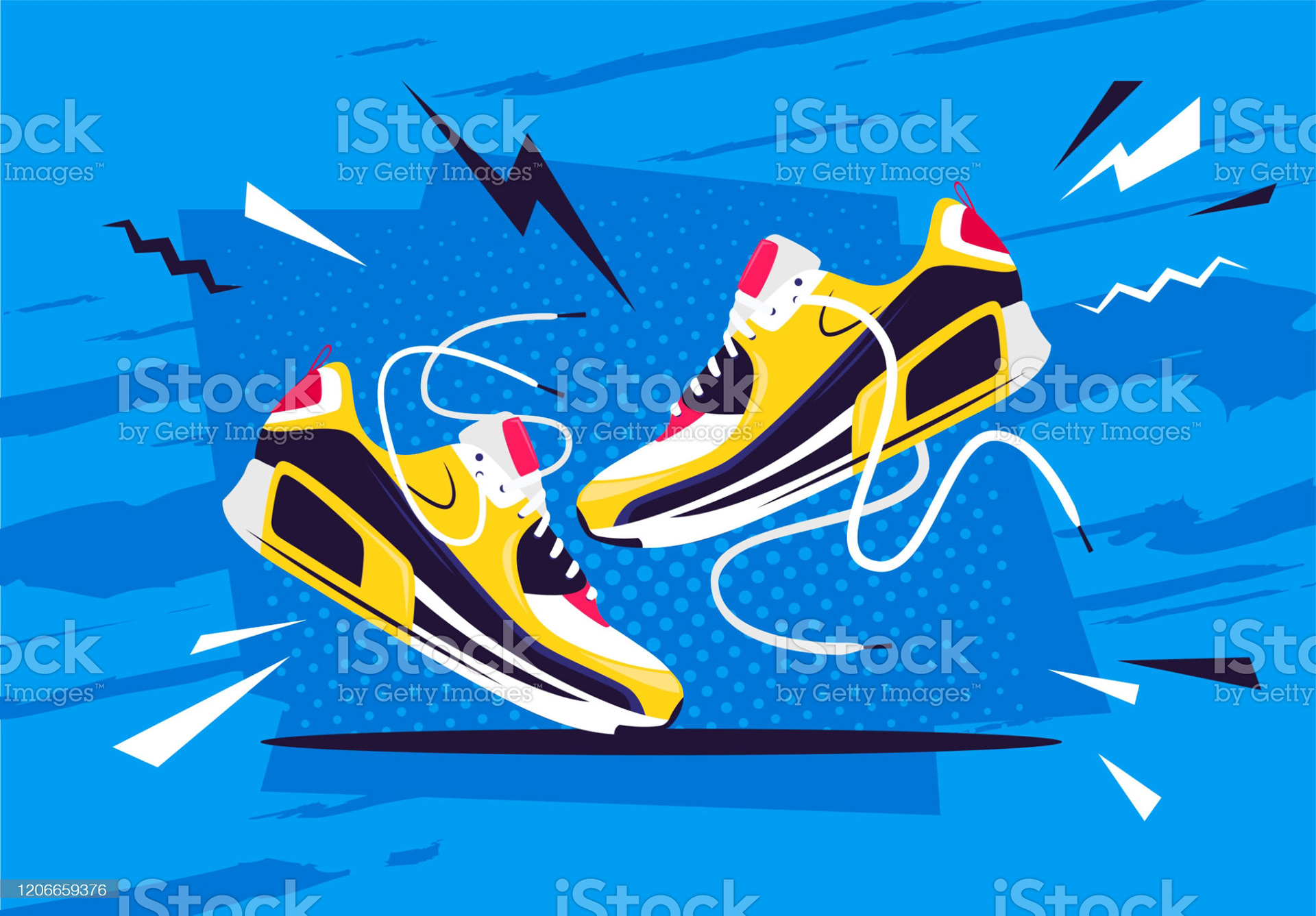
Above: Inspiration for the campaign.
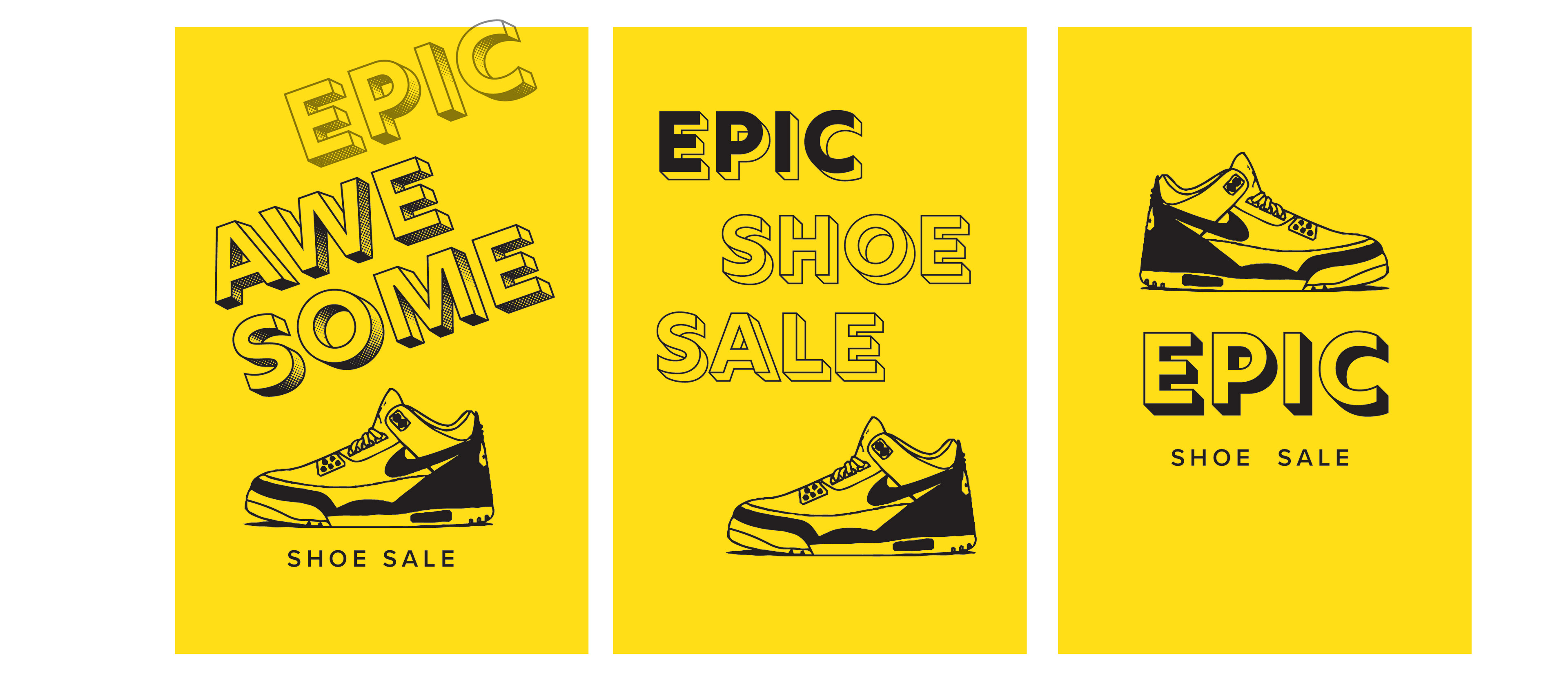
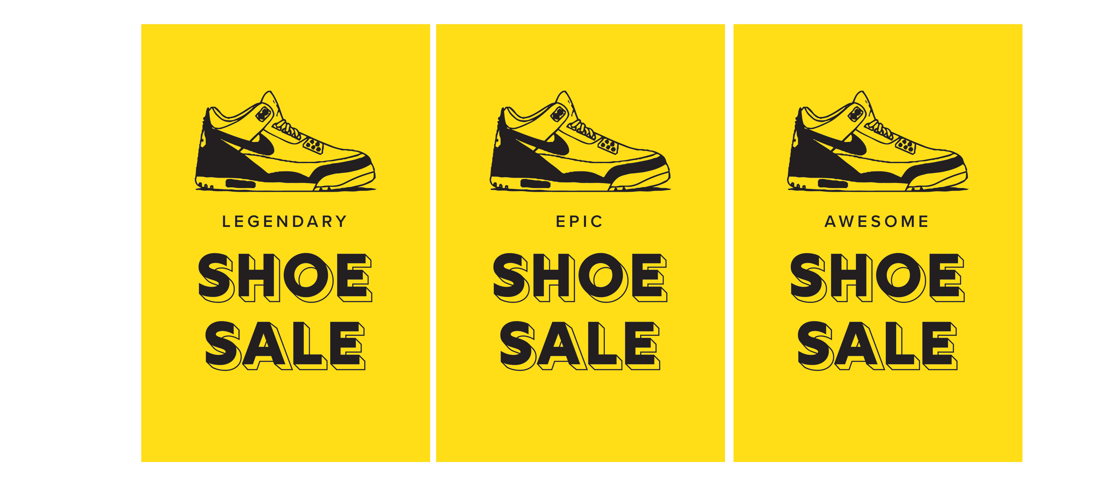
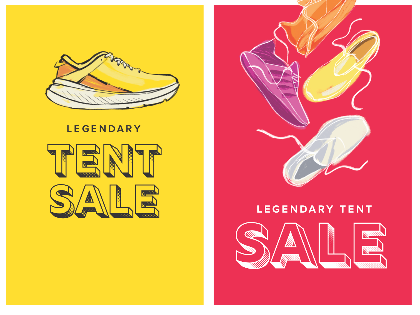
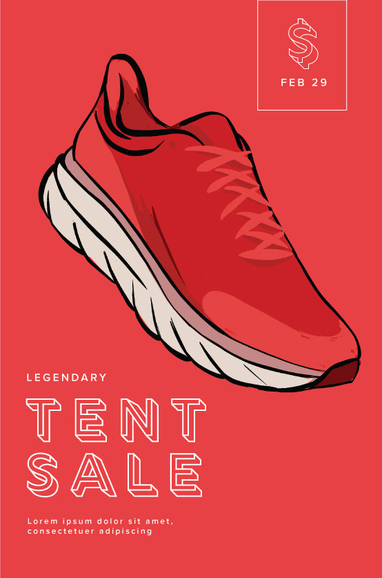
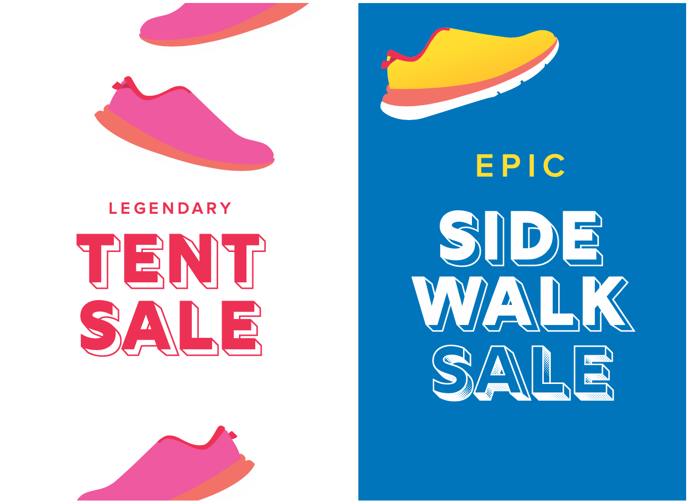
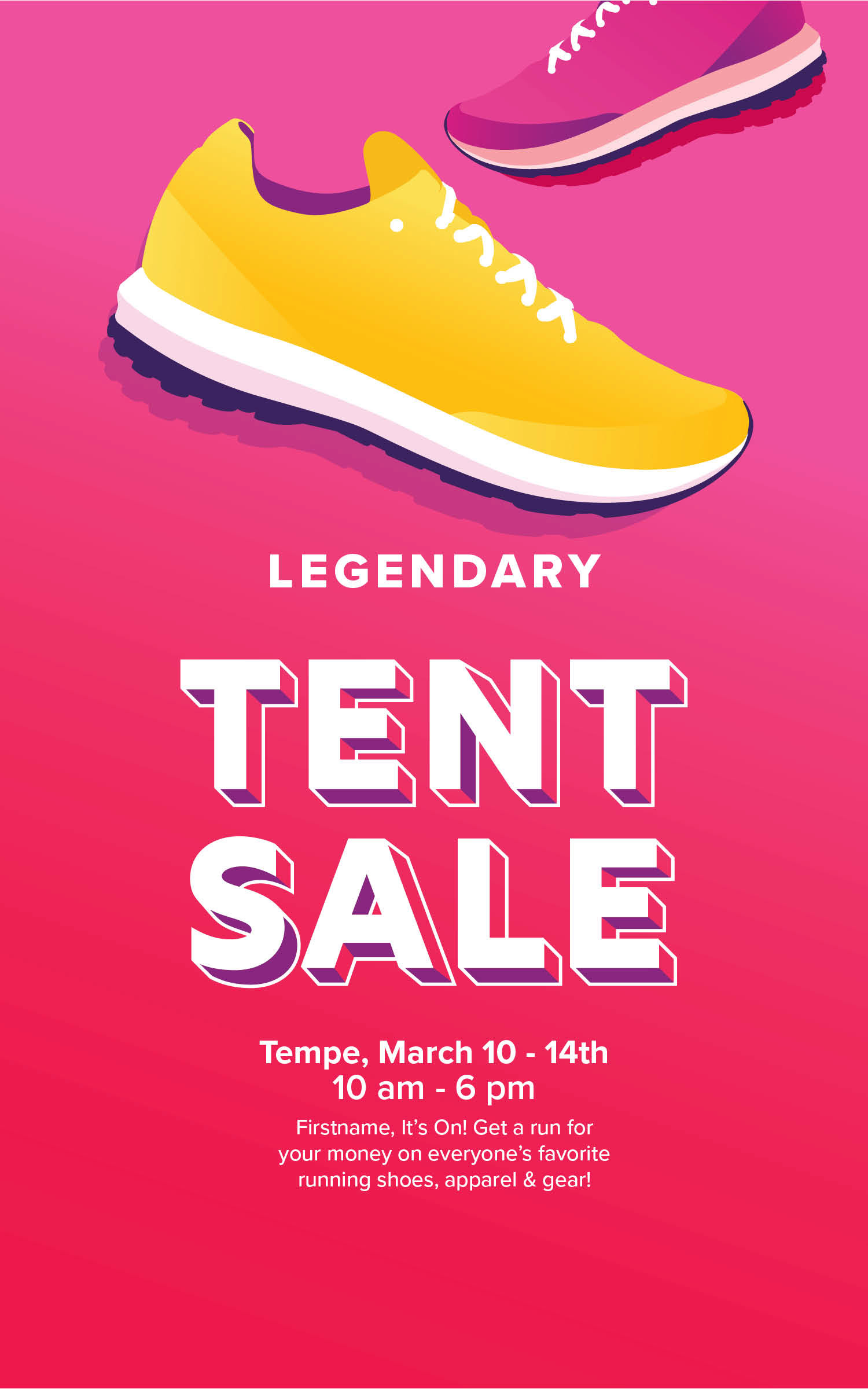
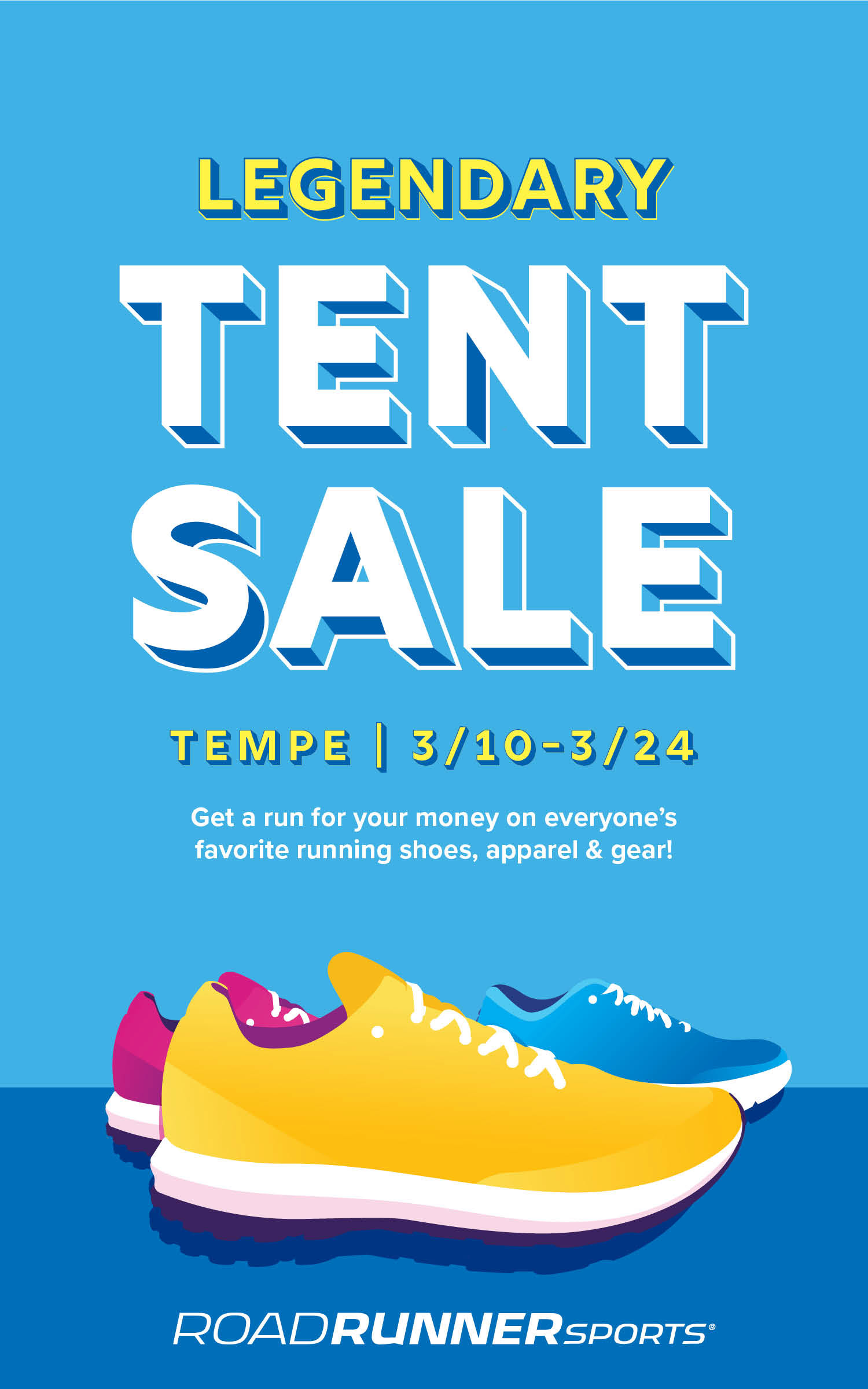
Below: Option 1 mockups featuring illustrated shoes. The CEO requested bright colors and shoes that read as generic and not specific to any one brand. As the concept evolved, the shoes were refined and rebuilt as vector artwork in Adobe Illustrator.
Below: Option 1 mockups featuring illustrated shoes. The CEO requested bright colors and shoes that read as generic and not specific to any one brand. As the concept evolved, the shoes were refined and rebuilt as vector artwork in Adobe Illustrator.
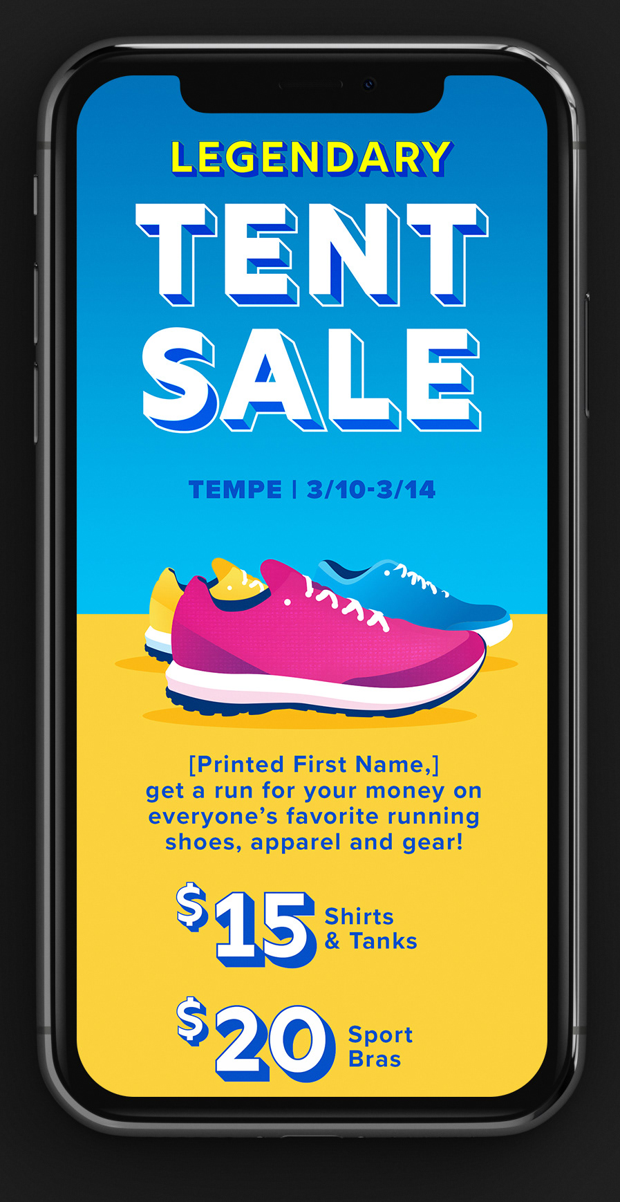
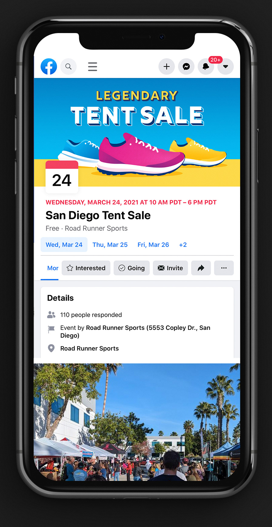
I advocated for the addition of animation in the campaign's social posts, which was received well. Files were created in After Effects
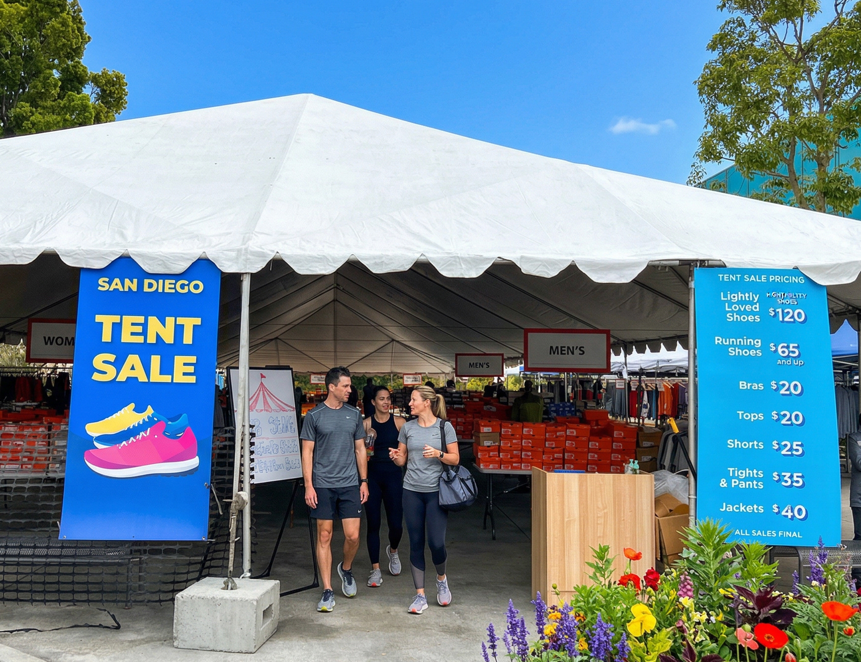
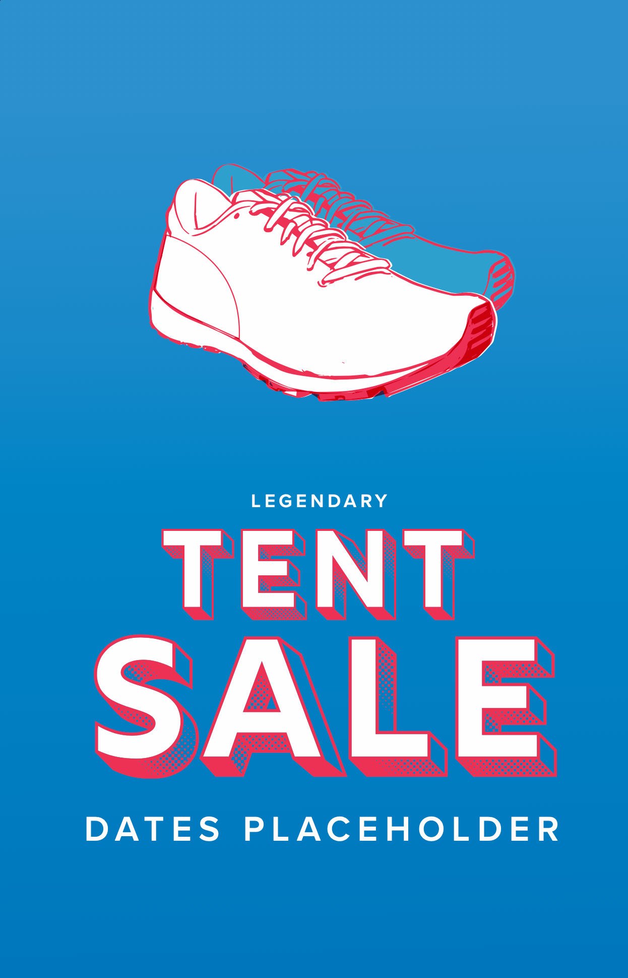
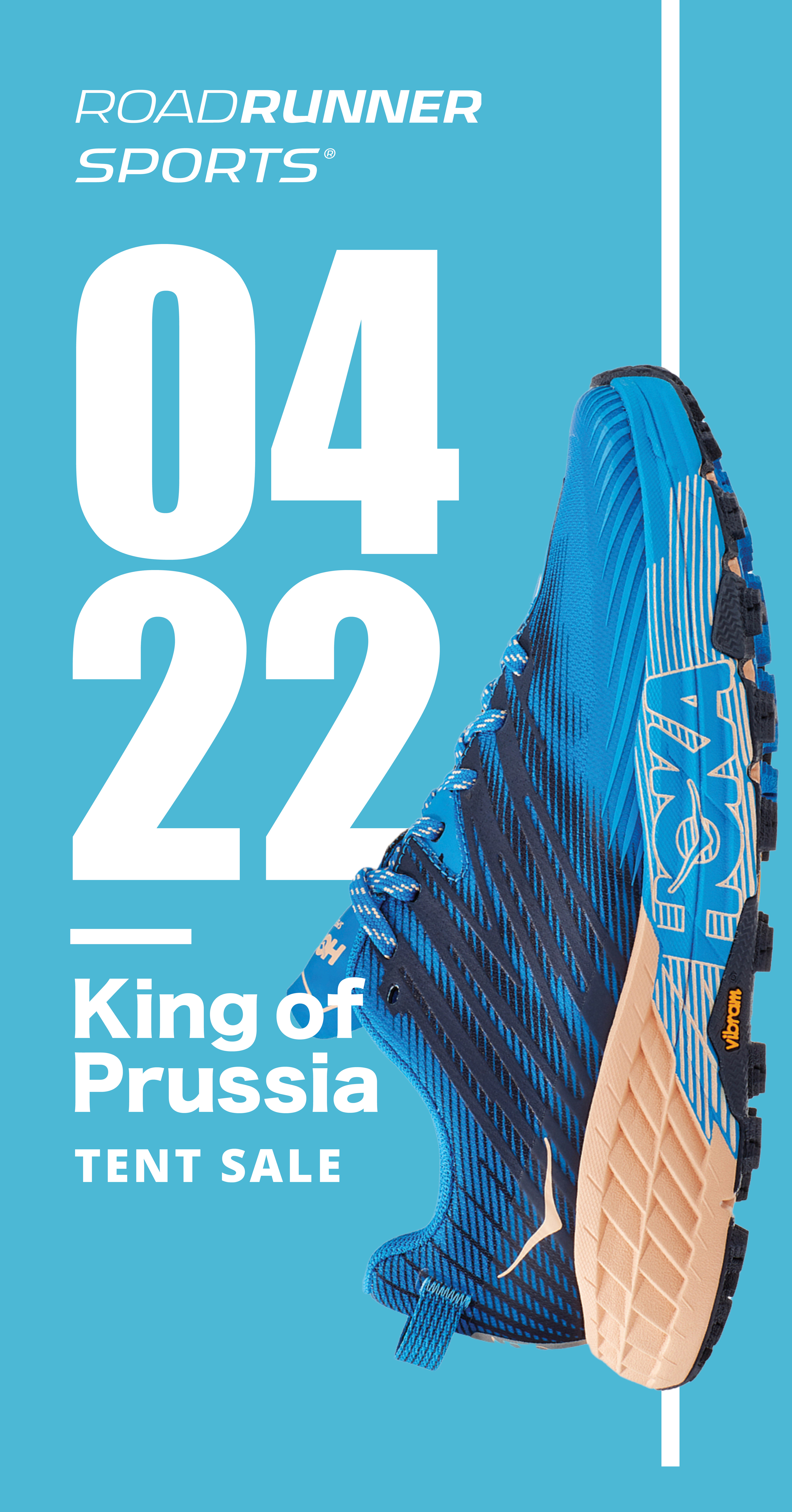
Below: Option 2 mockups with photos of shoes rather than illustrations.

Above: The final layout of the 9 X 6 printed postcard mailers. Using the product photo as the hero image and keeping the typography simple and close to the branded fonts in style.
Below: Option 2 mockups. A google banner ad (on the left) and a static social post (in the middle). An animated video for social media (on the right).
Below: Option 2 mockups. A google banner ad (on the left) and a static social post (in the middle). An animated video for social media (on the right).
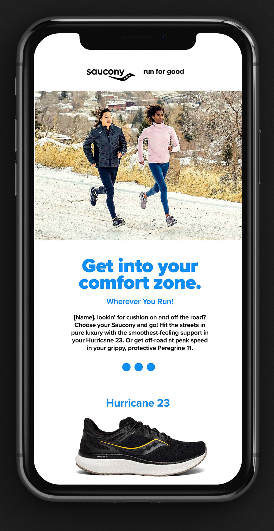
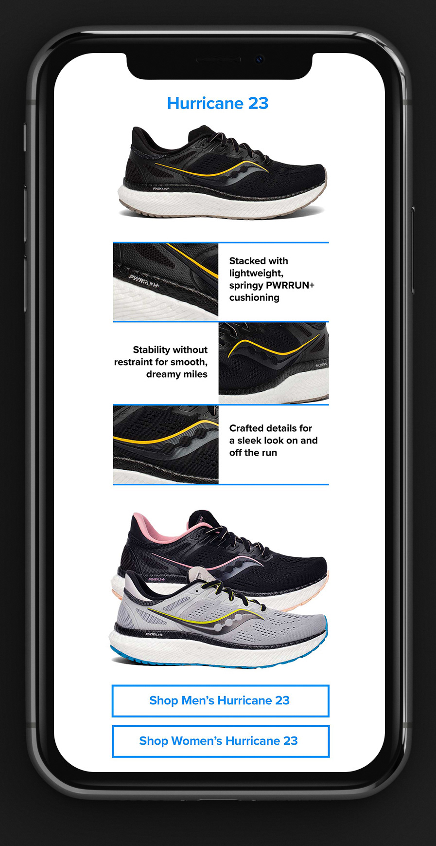
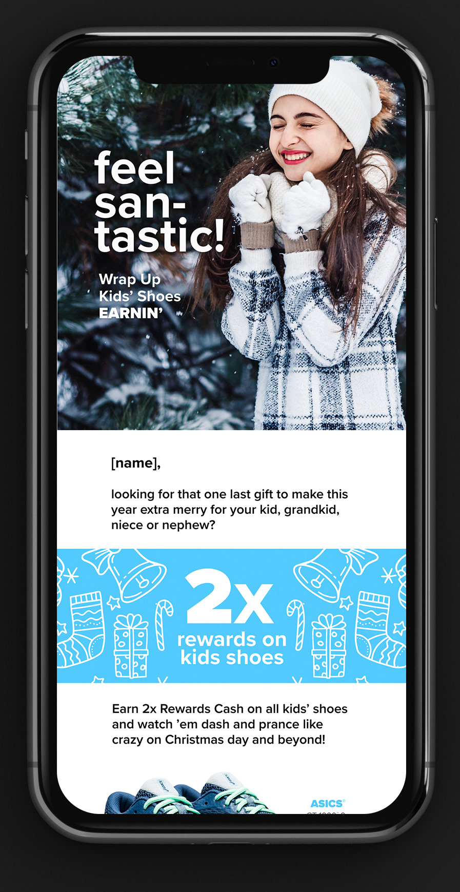
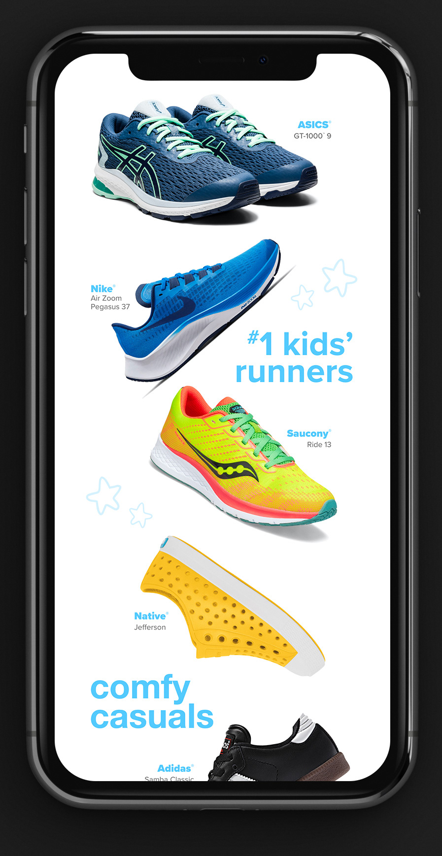
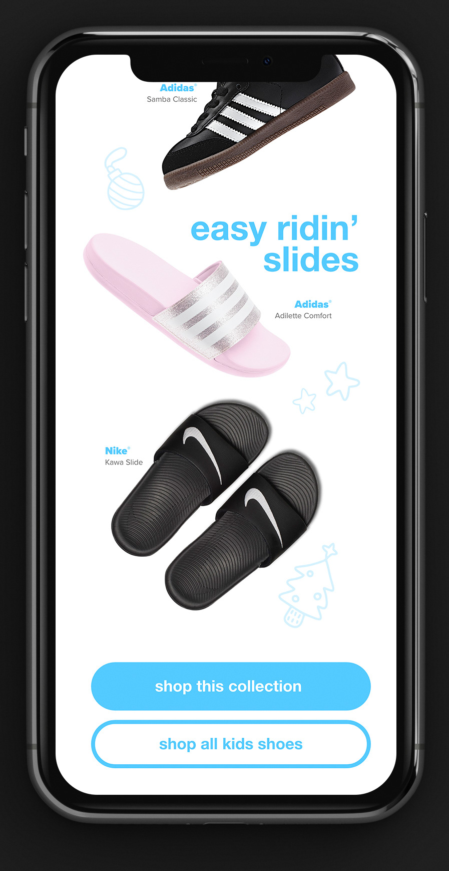
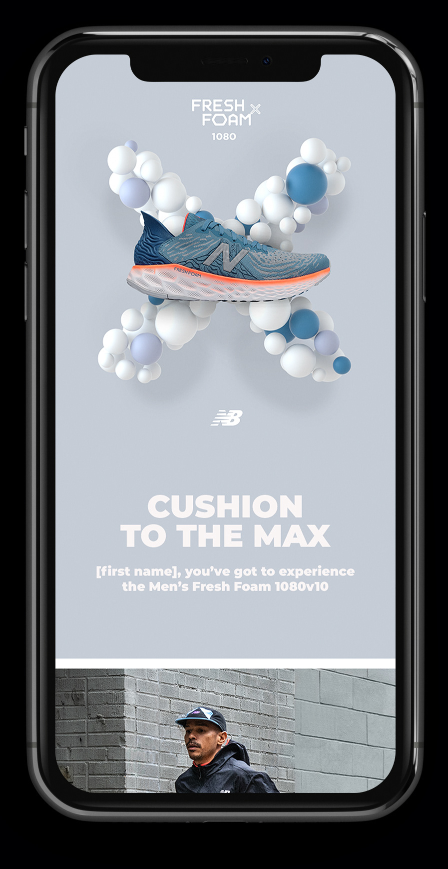
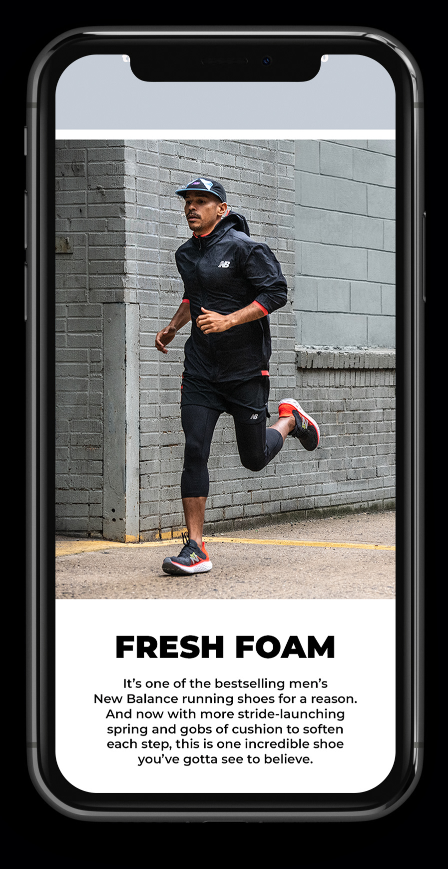
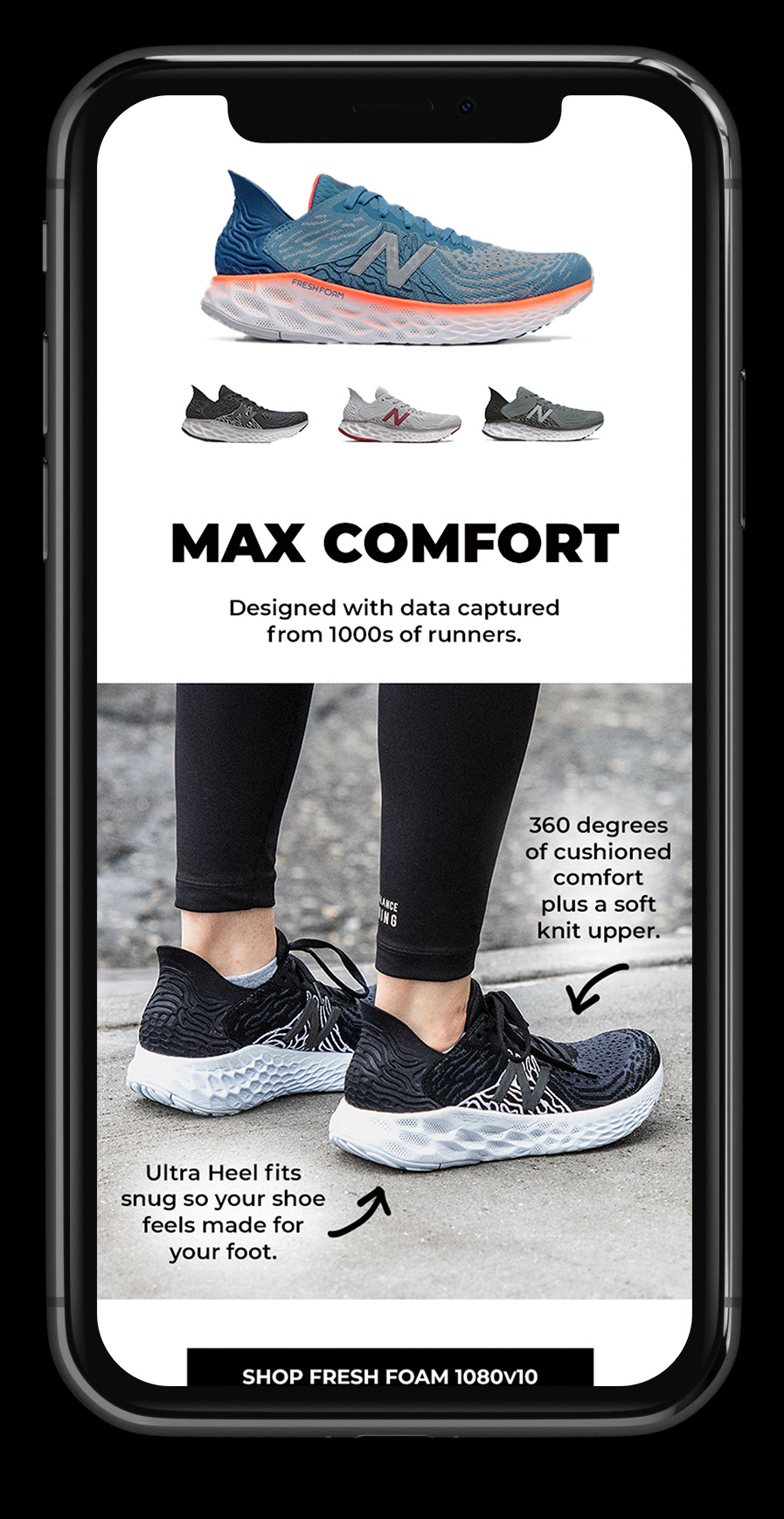
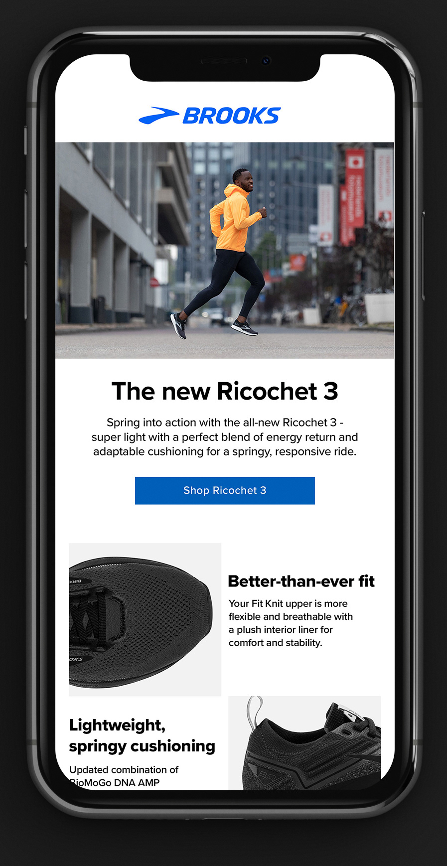
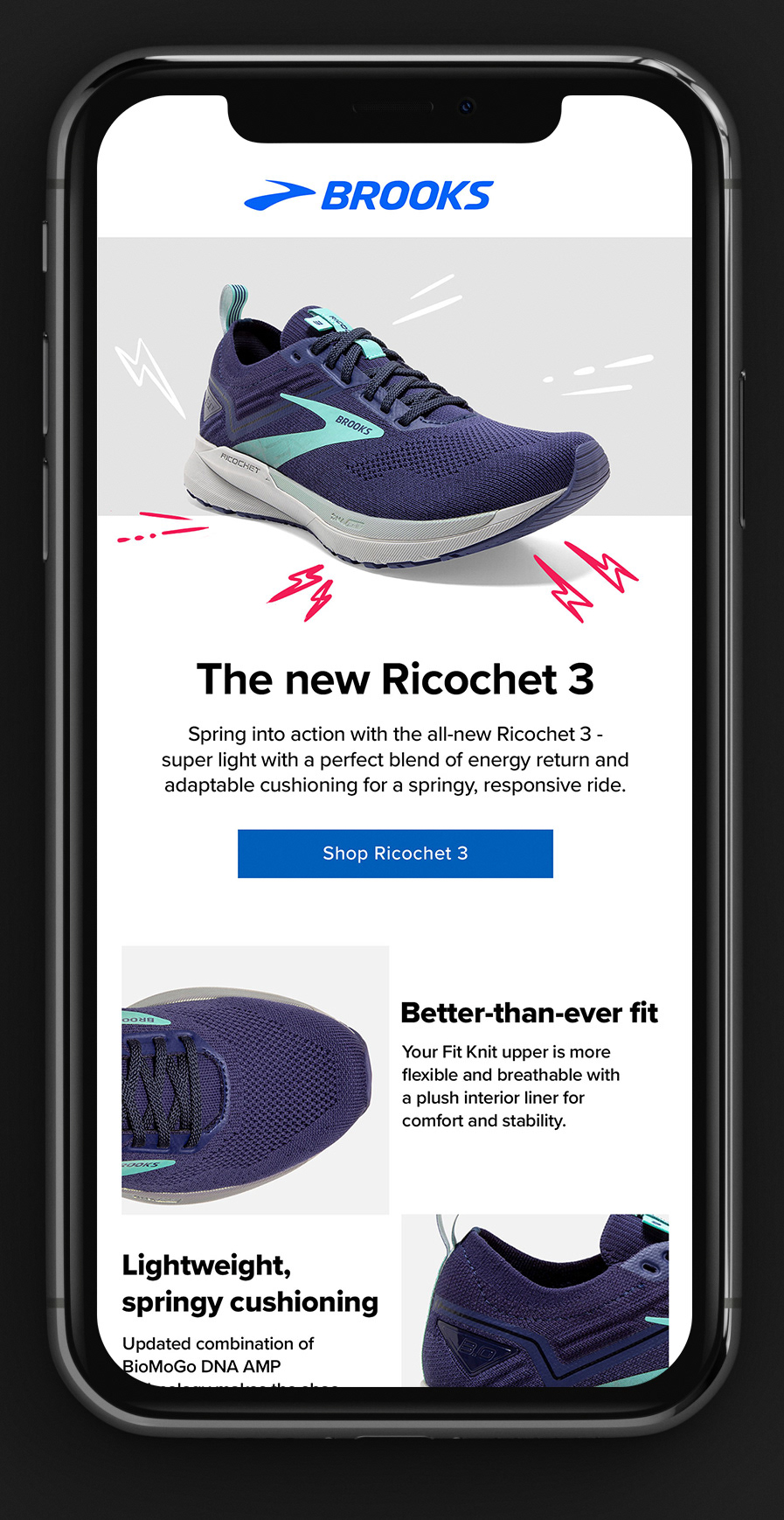
Below: A few of the many emails that I designed.
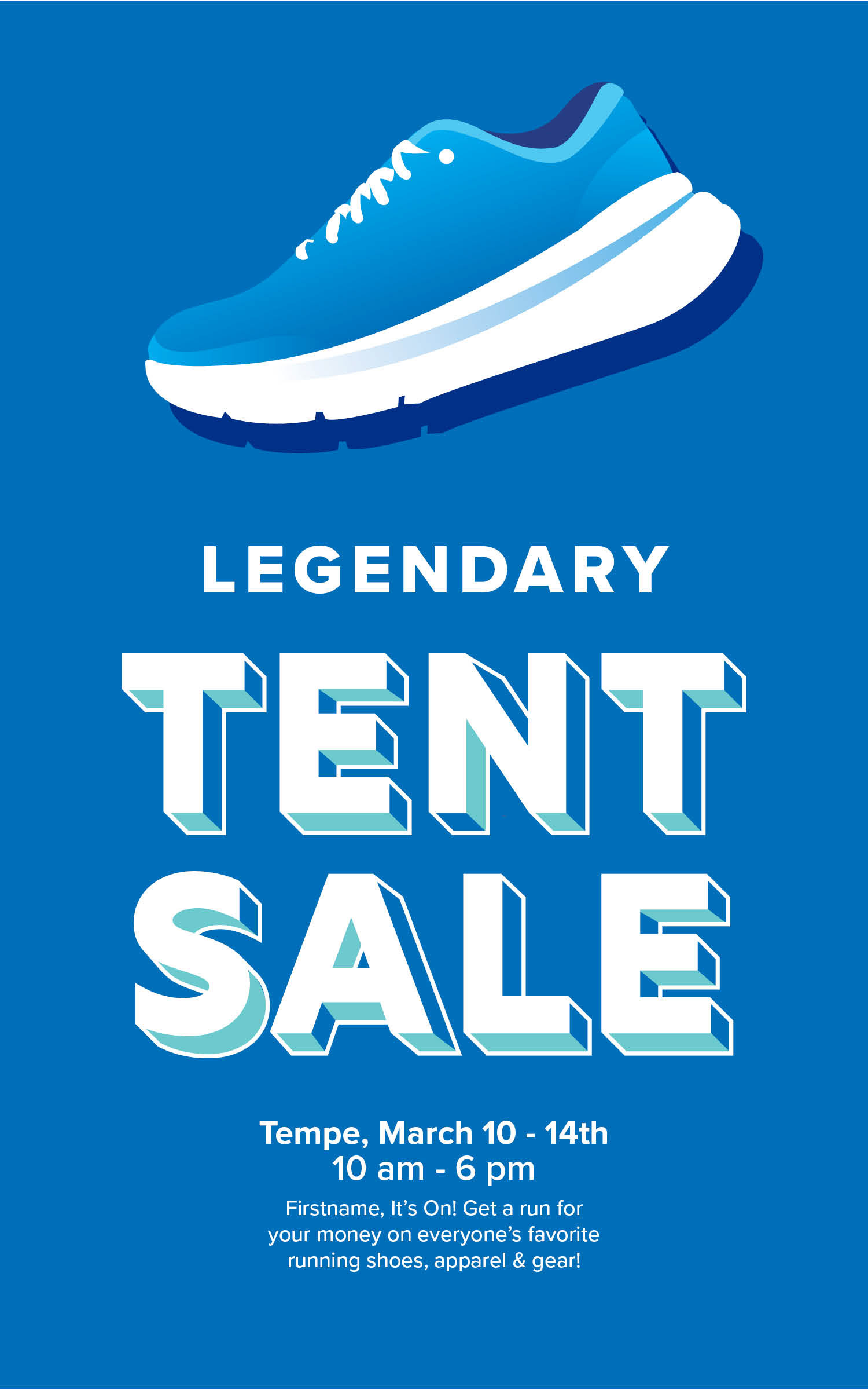
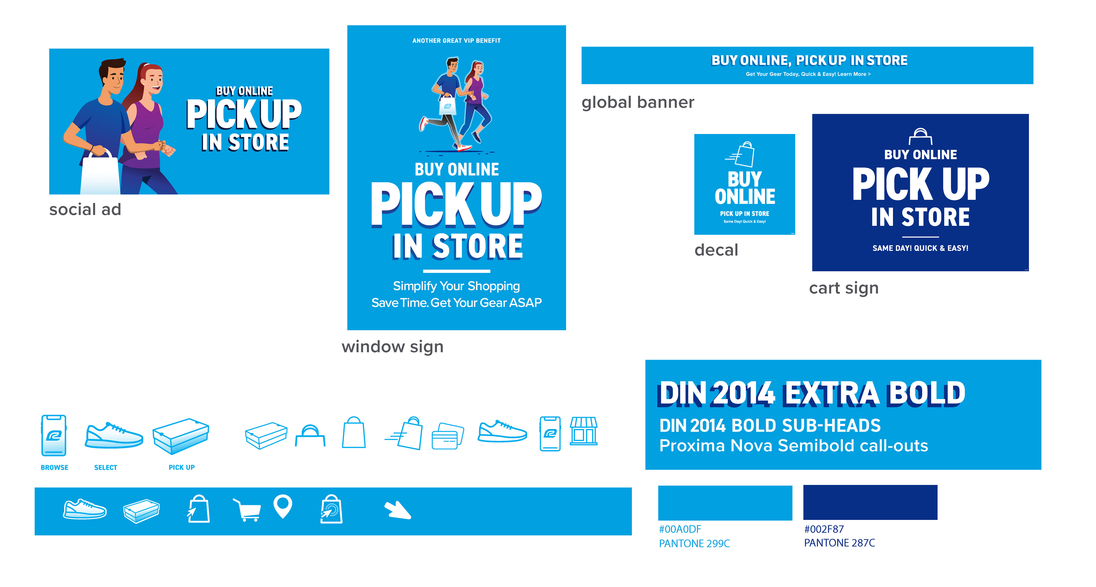
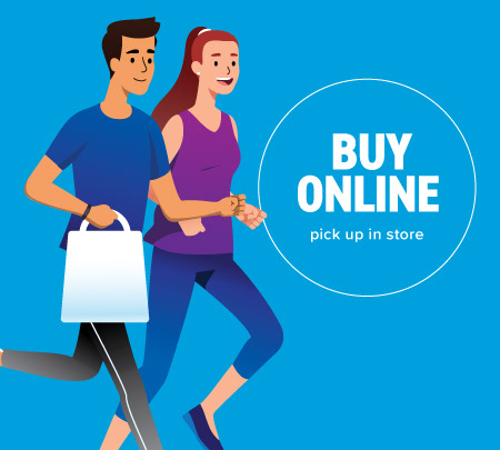
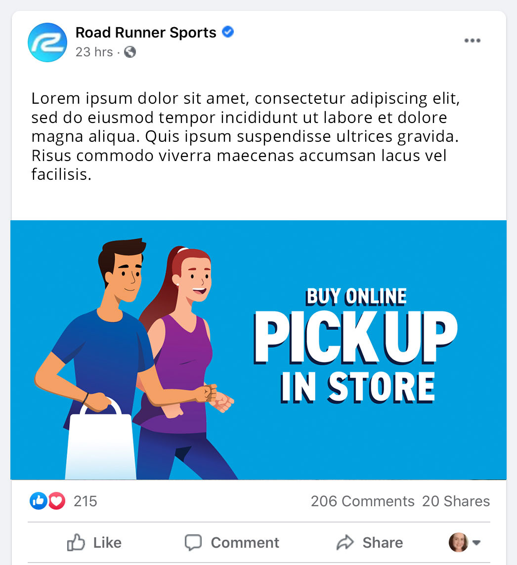
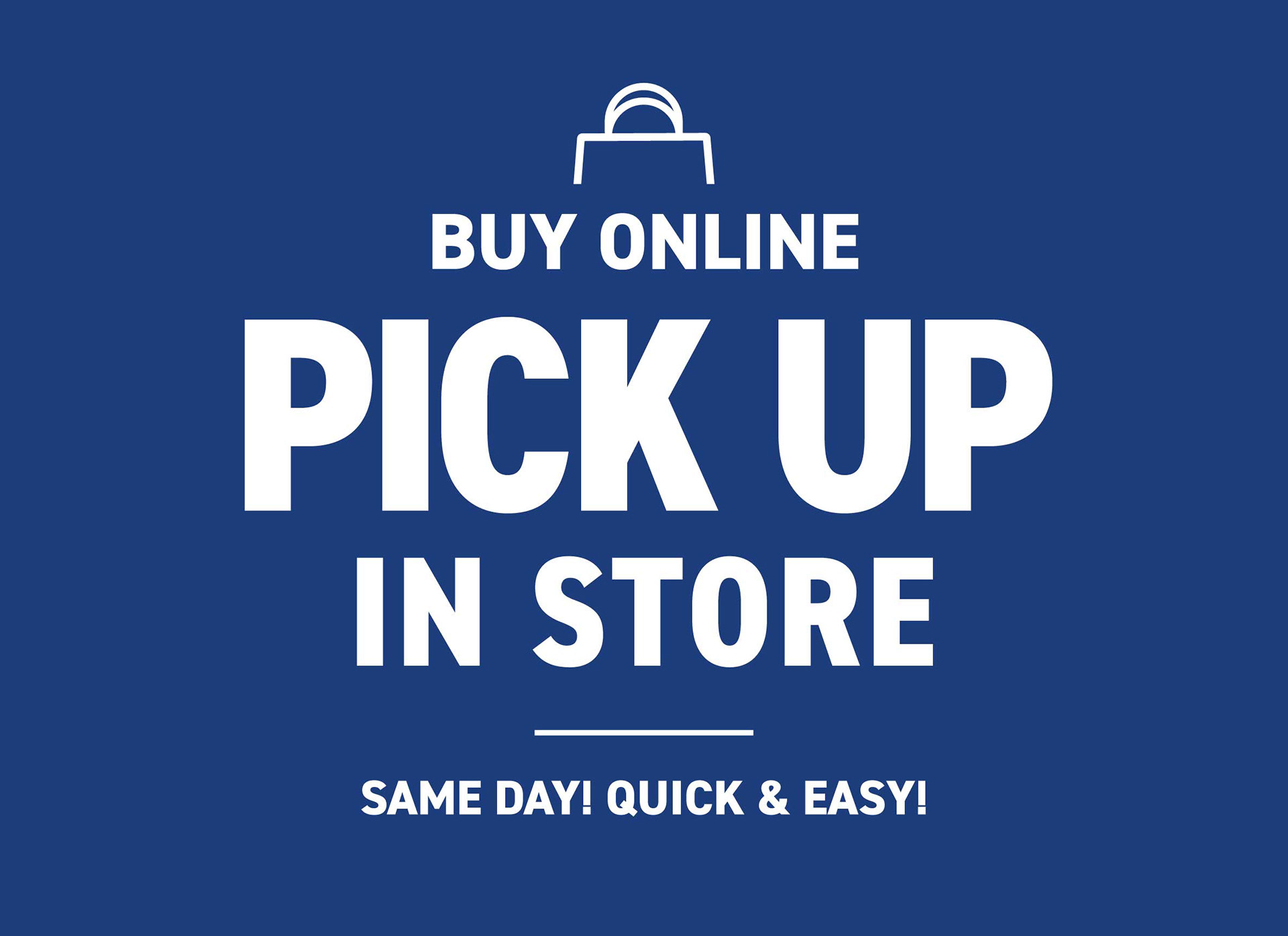
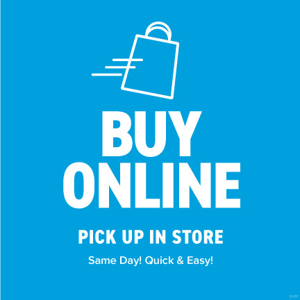
Below: A campaign for in-store pick-up using stock illustrations. This campaign had to be concepted, approved and launched in under 3 weeks. I leveraged the store's primary brand color, blue.
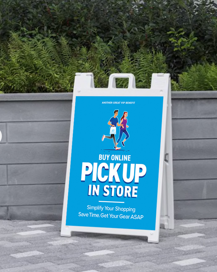


Below: You can see a poster that was installed for this campaign hanging in the front window of this retail location.
