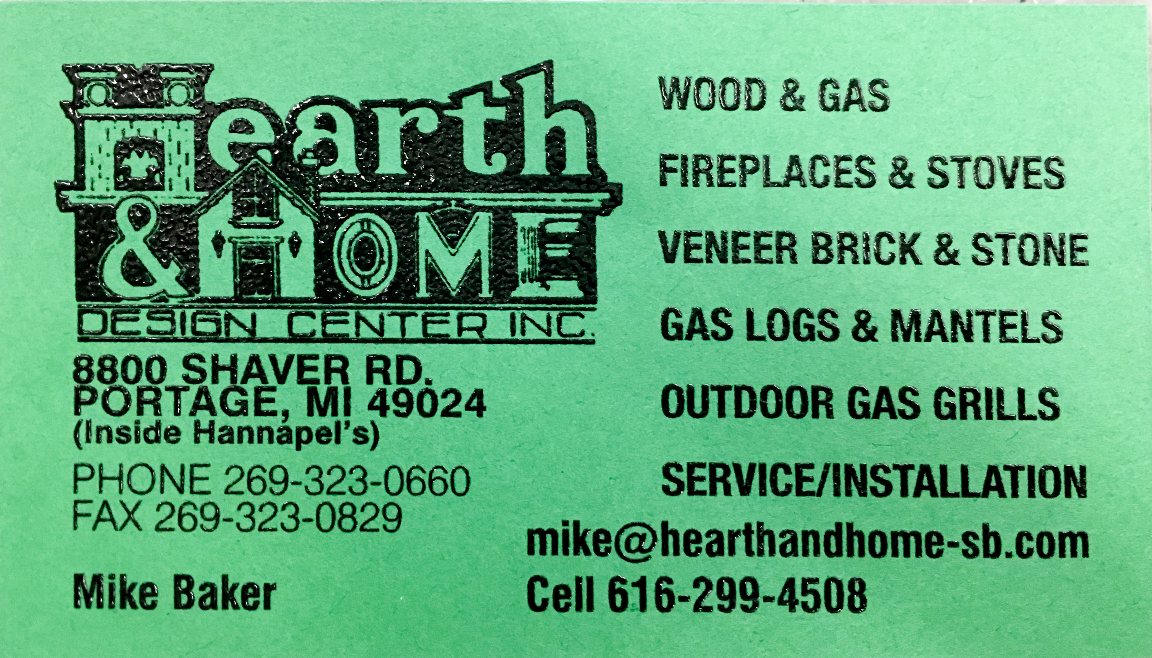
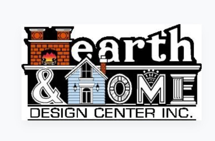
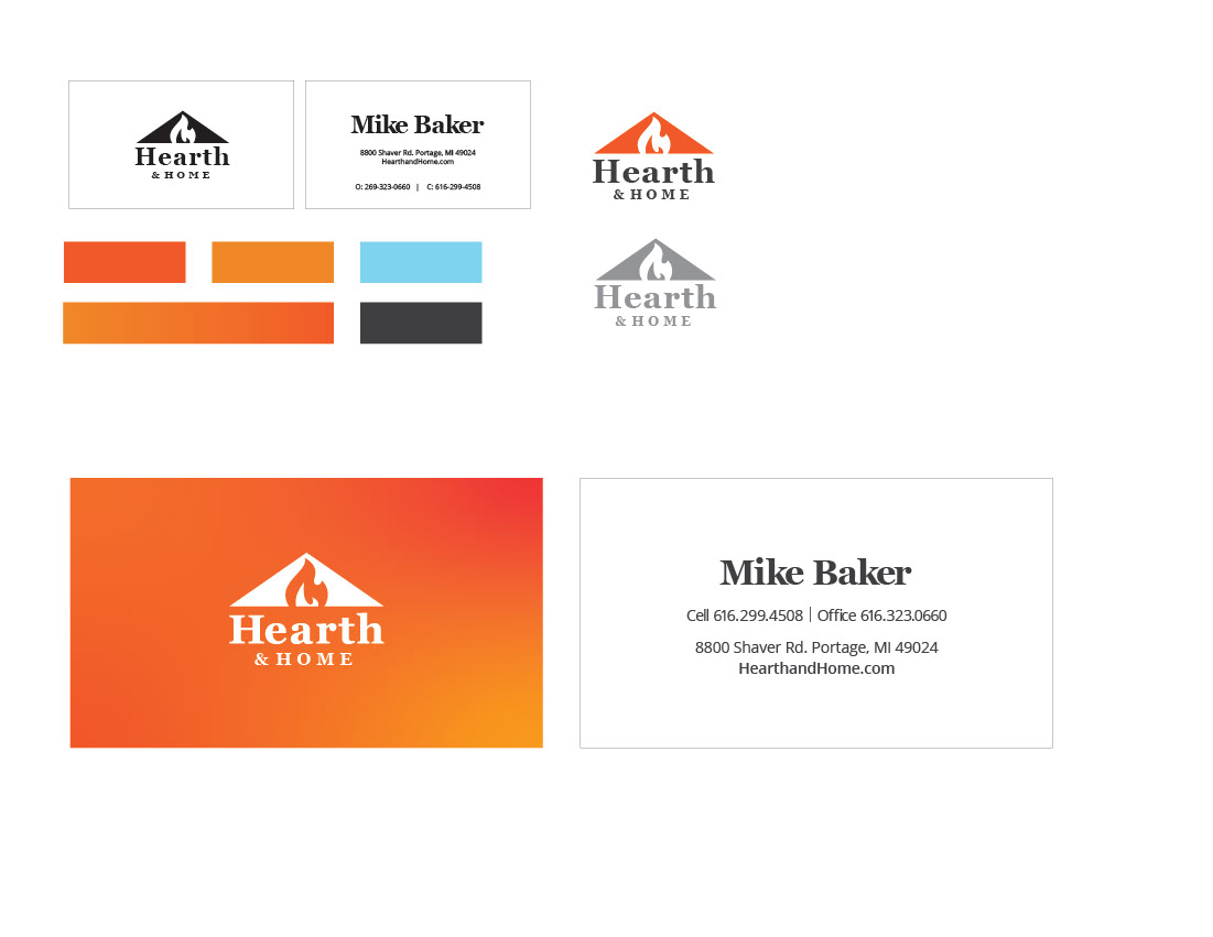
[ above - client logo to be re-designed ]
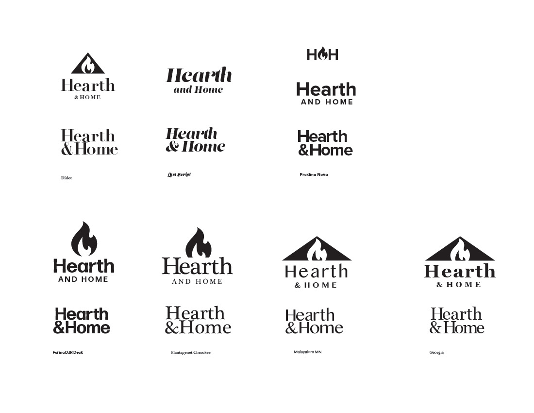
Direction: "The logo is bulky and out dated. The owners love it, but their sales team hates it." The client asked to give the logo a more "clean" look while still maintaining some of the ideas from the original.
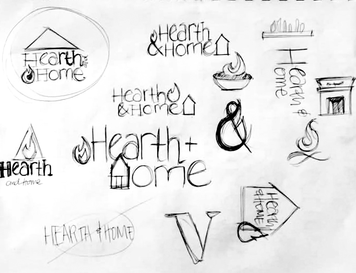

[ above - sketches ]
I played with triangles to symbolize "home" and flames to symbolize "hearth." I thought about using a traditional fireplace, like the original logo, but I didn't like how heavy that felt.


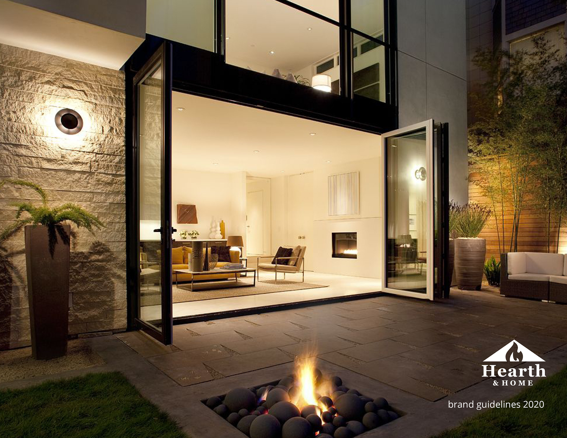
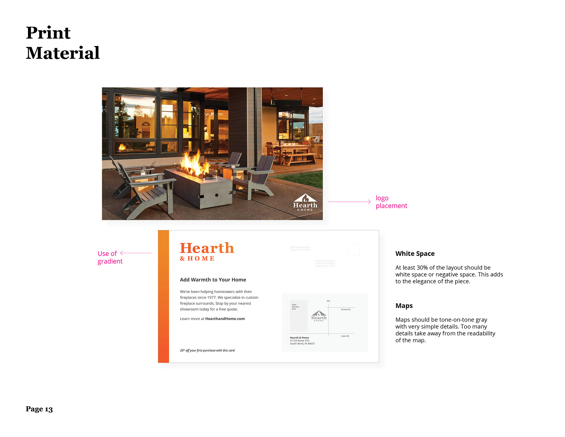
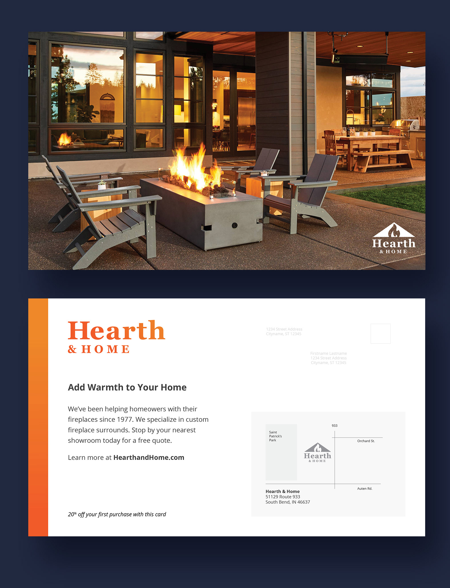
[ below: mailer design ]
I wrote the copy for this mailer and worked with some of the client's vendors to obtain the product shot for the cover. I created a simple vector map for the back of the postcard. The client loved it!
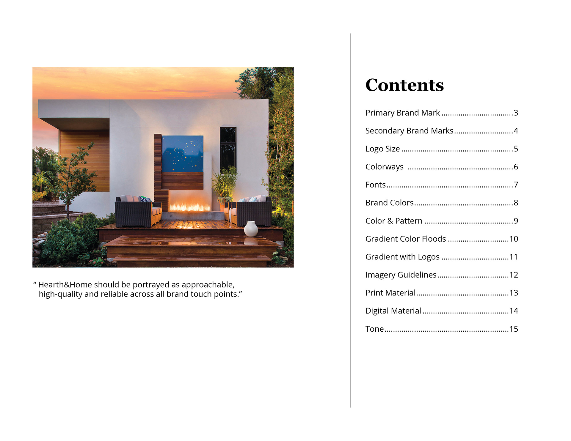
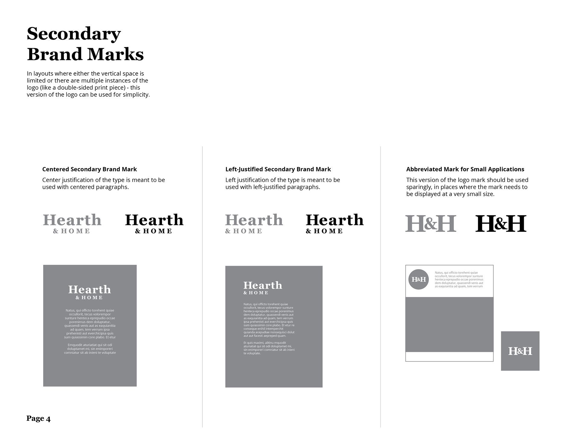
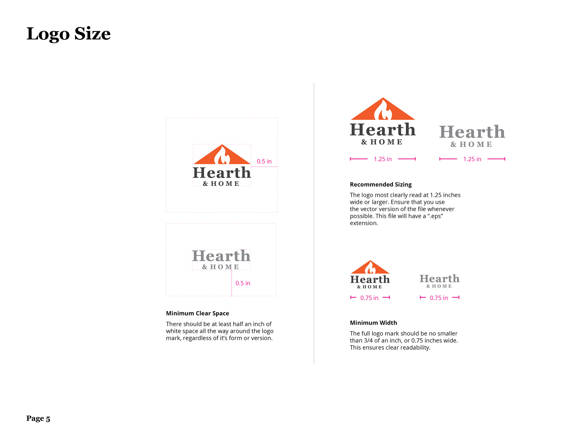
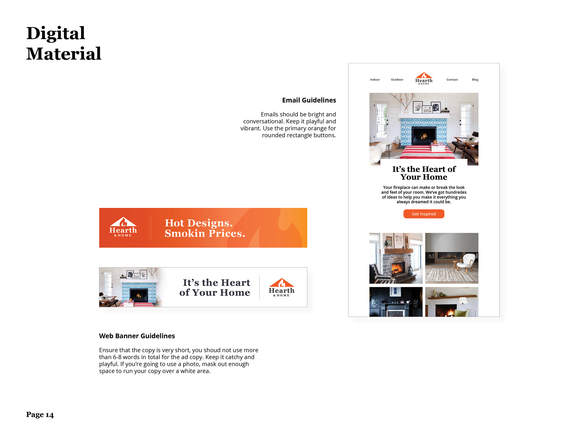
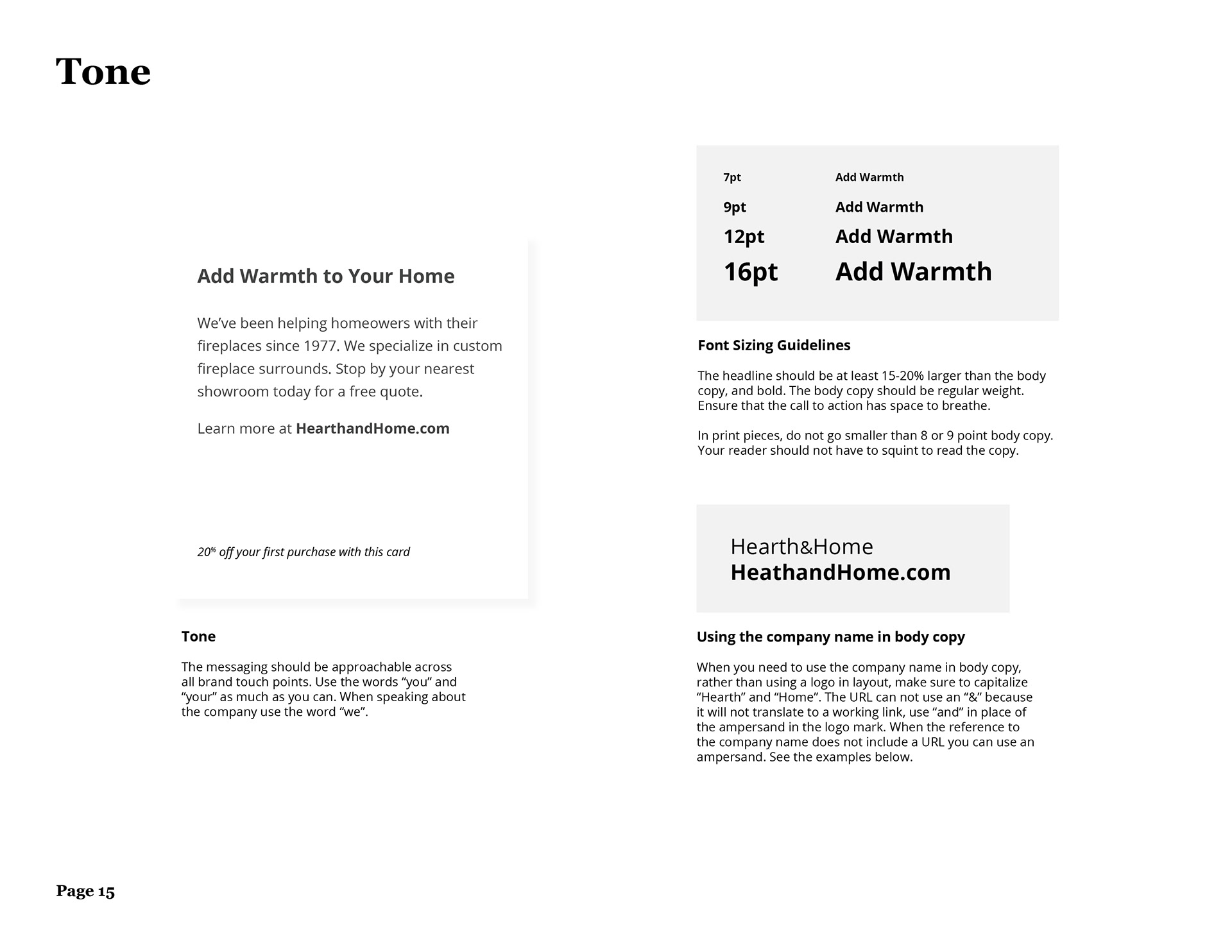
[ below: Brand Guidelines ]
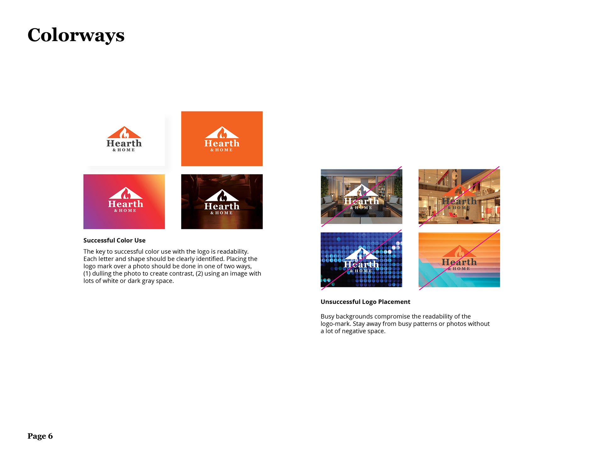
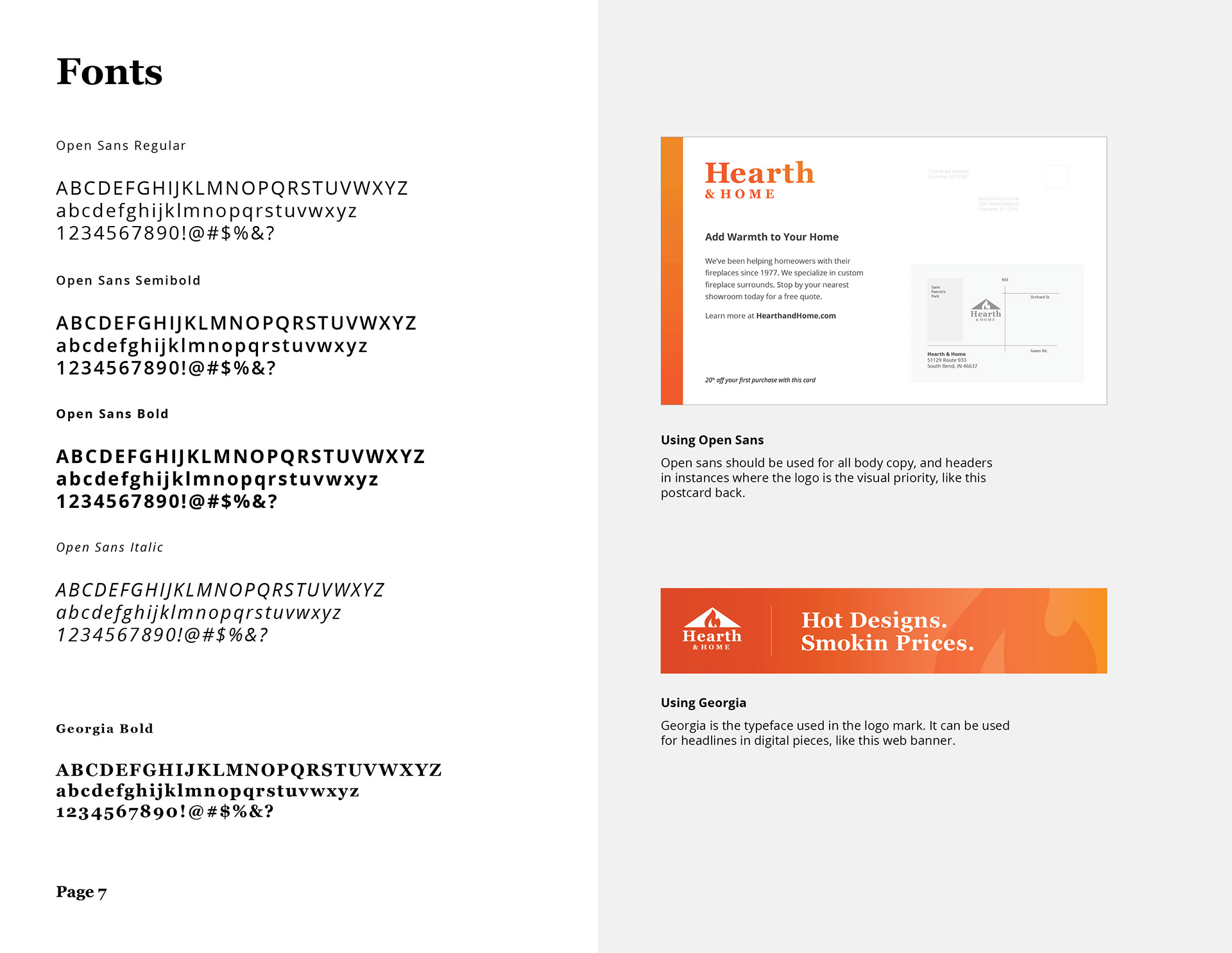
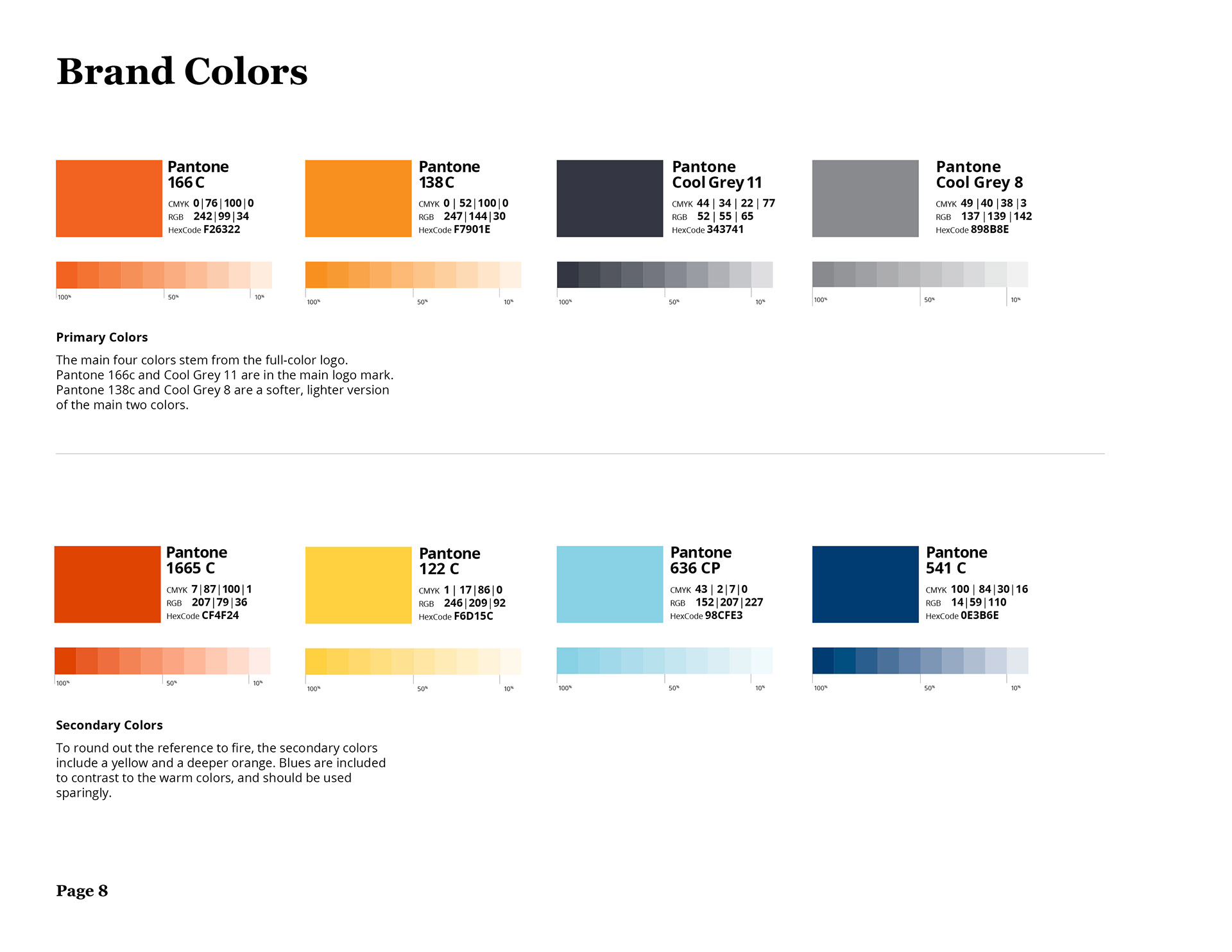
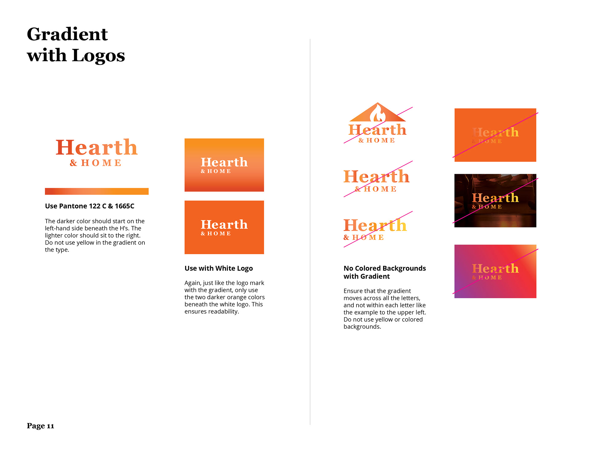
I created an initial 15 page branding guideline to work through some of the scenarios the client was likely to encounter, like social media applications and color variations. I had a blast playing with pattern and layout on these initial mockups. The owners were very excited to see things take shape.